
Know what’s next in digital retail
We’re future-izing your inbox! Say hello to our weekly Future Commerce newsletter.
-

- VOLTAGE Jan 26


Is your homepage scaring people away? A surprising number of well-known websites make these common UX mistakes.
When you hear “homepage,” one thing should come to mind. First impression.
You have one shot to deliver a first impression. That’s why your homepage should be perfectly tuned. A well-executed page must simultaneously:
While no site is perfect, simple mistakes disrupt the site’s user experience and path to purchase thereby tanking conversions as potential customers click away. We’ve compiled a list of the top five most common homepage mistakes and how to combat them on your retail or eCommerce site.
Poor representation, or not accurately communicating the full scope of your site on your homepage, plagues a surprising number of brands. For example, if you sell clothing, shoes and jewelry, all three of these categories should be visible in some capacity on your homepage.
Consumers don’t dig through a website looking for things they think will meet their retail needs. They want to dial in on what they are looking for right away. Failing to correctly represent your site can:
To solve these problems, use solutions like featured categories and department links on the homepage effectively displayed to inform users of your website’s contents.
Pro tip: Be careful you’re not cluttering the design or wasting valuable real estate on your page.
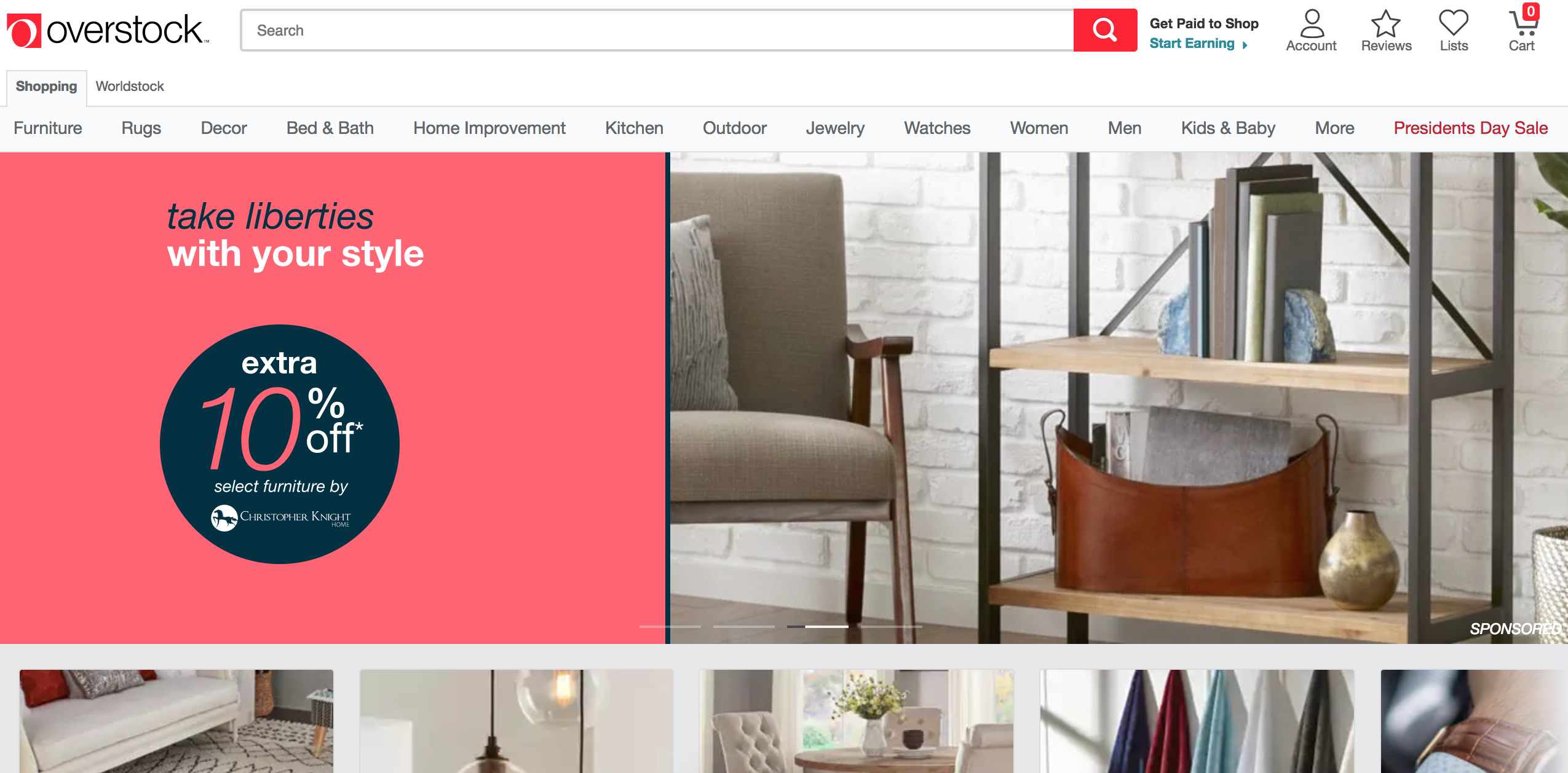
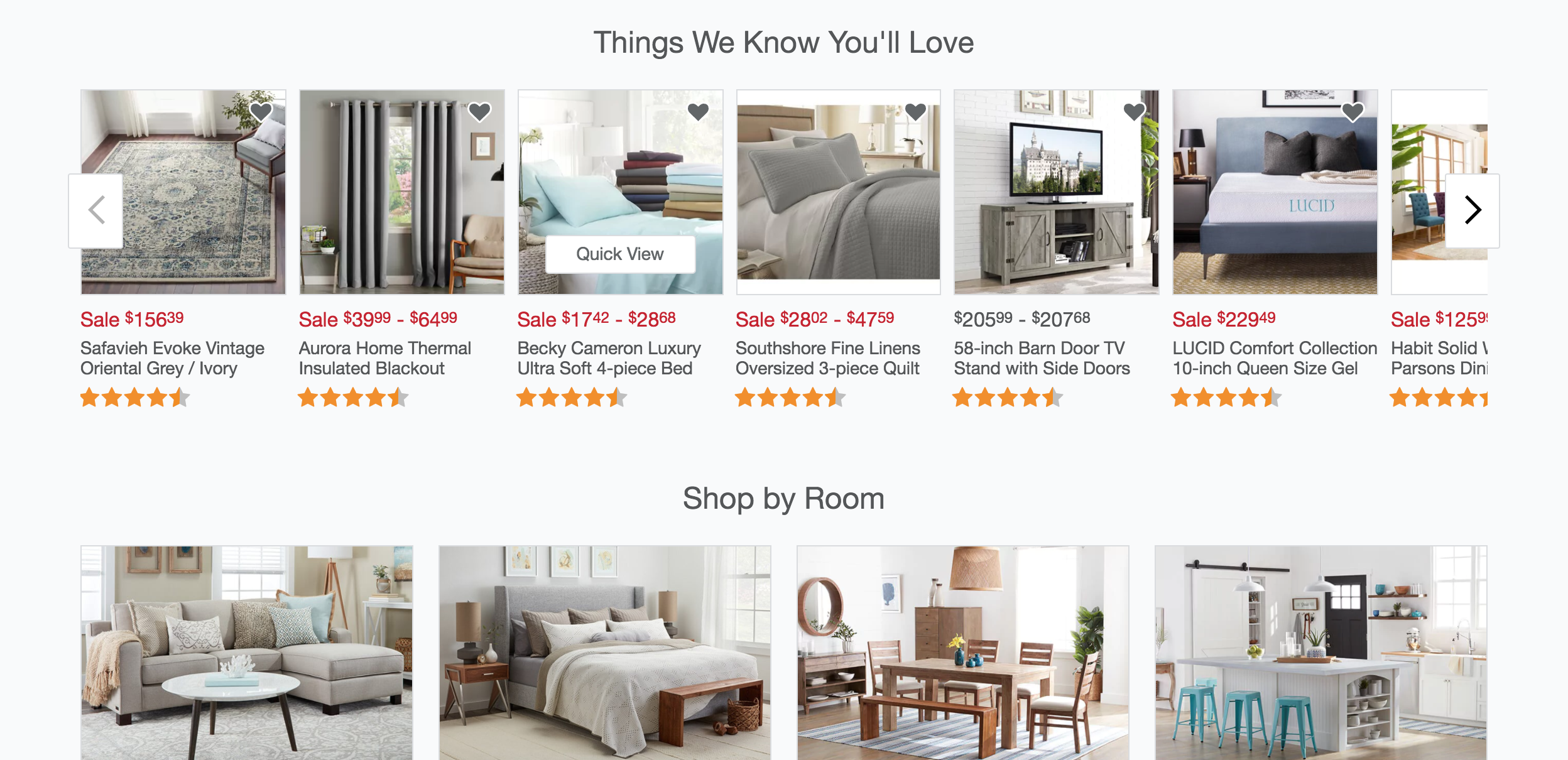
Here’s an example of poor representation on the homepage: Overstock.com
Overstock.com almost exclusively features furniture and home decor, but further exploration reveals they also sell jewelry, kitchen appliances and sporting equipment.
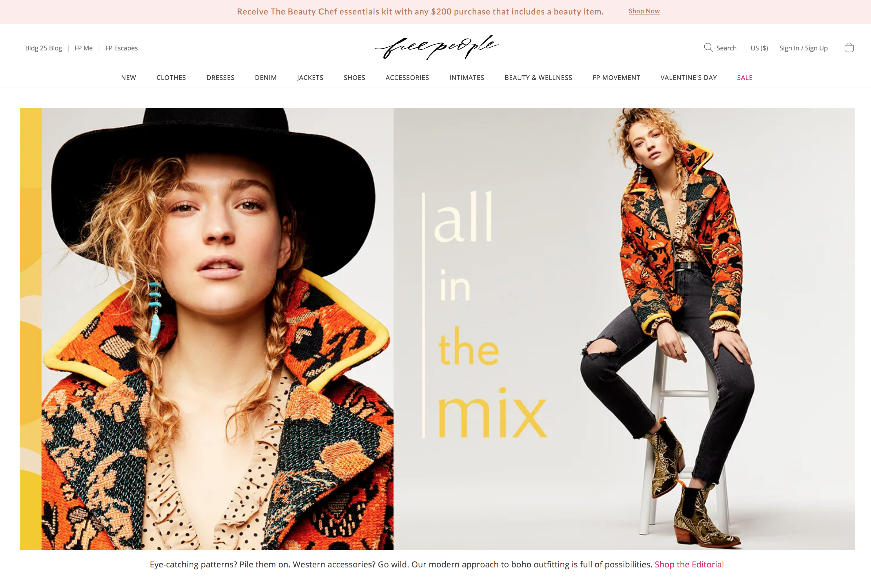
And here’s an example of a well-executed homepage: Target
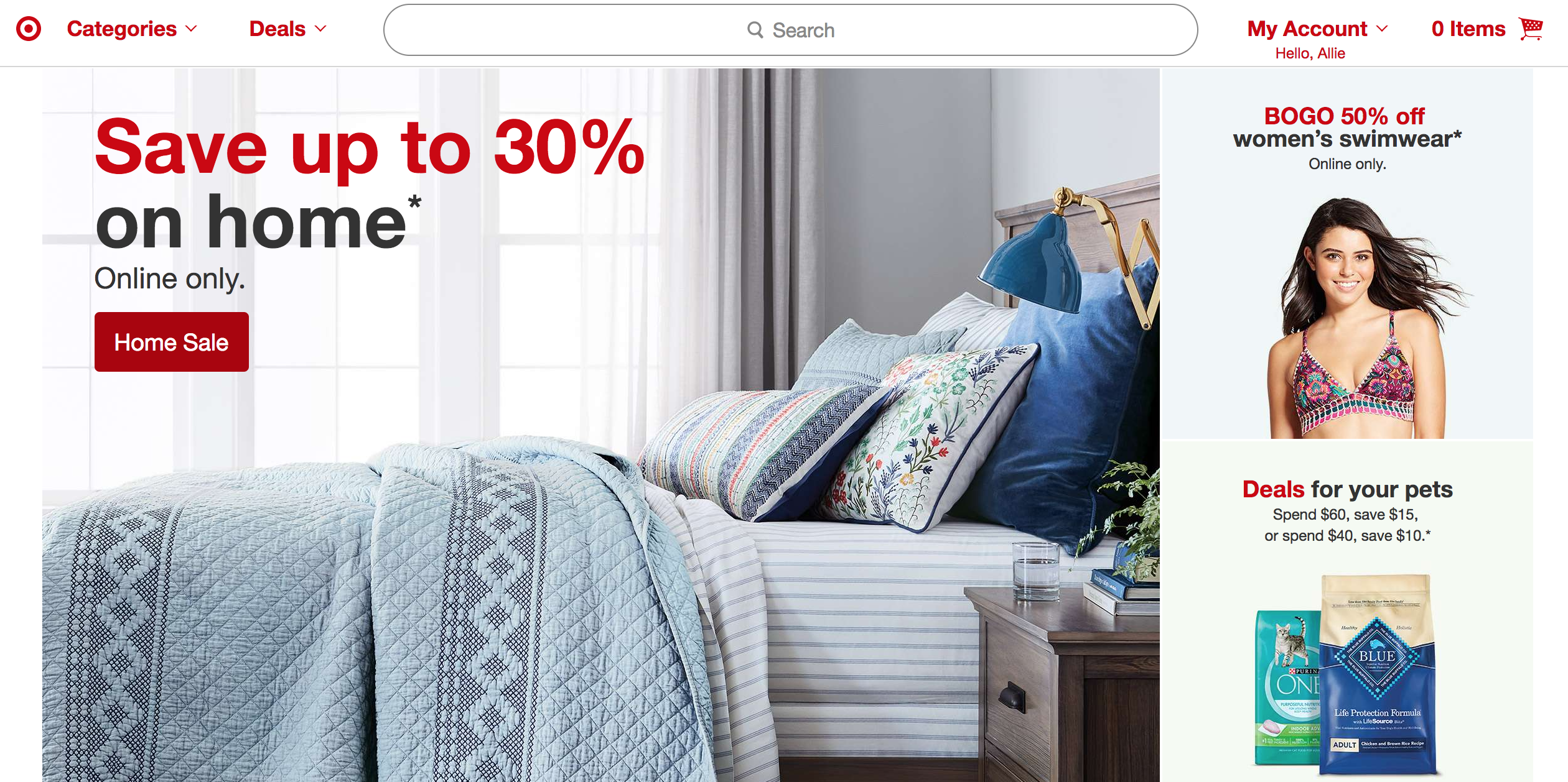
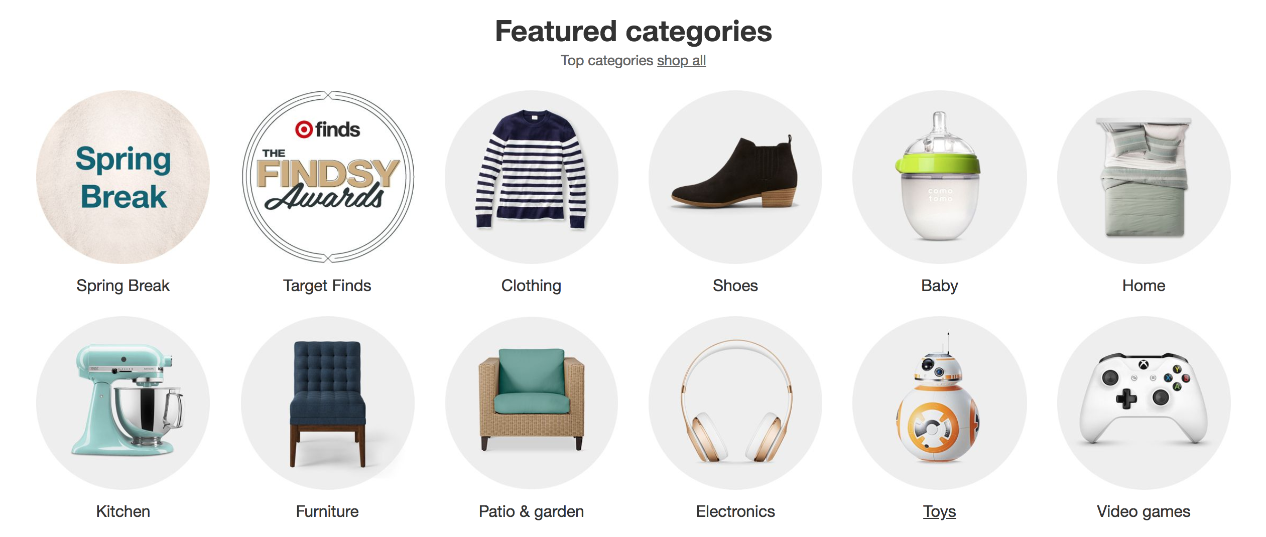
Target does an exceptional job of balancing featured items and different shopping categories. Target’s homepage even presents customers with all different shopping options on top of the full spectrum of categories.
Advertisements, or content that looks like ads, mark the second most disruptive homepage error. Pop-up boxes, page takeovers, promotions or dialog boxes are poorly perceived and often leave users with a negative, even spammy, impression. Not to mention heading for the proverbial exit in frustration.
Promotions, dialog boxes or site specials should be carefully executed. Consider size, placement, timing and overall look and feel when adding these to your page.
Poor “ad” executions: Birchbox
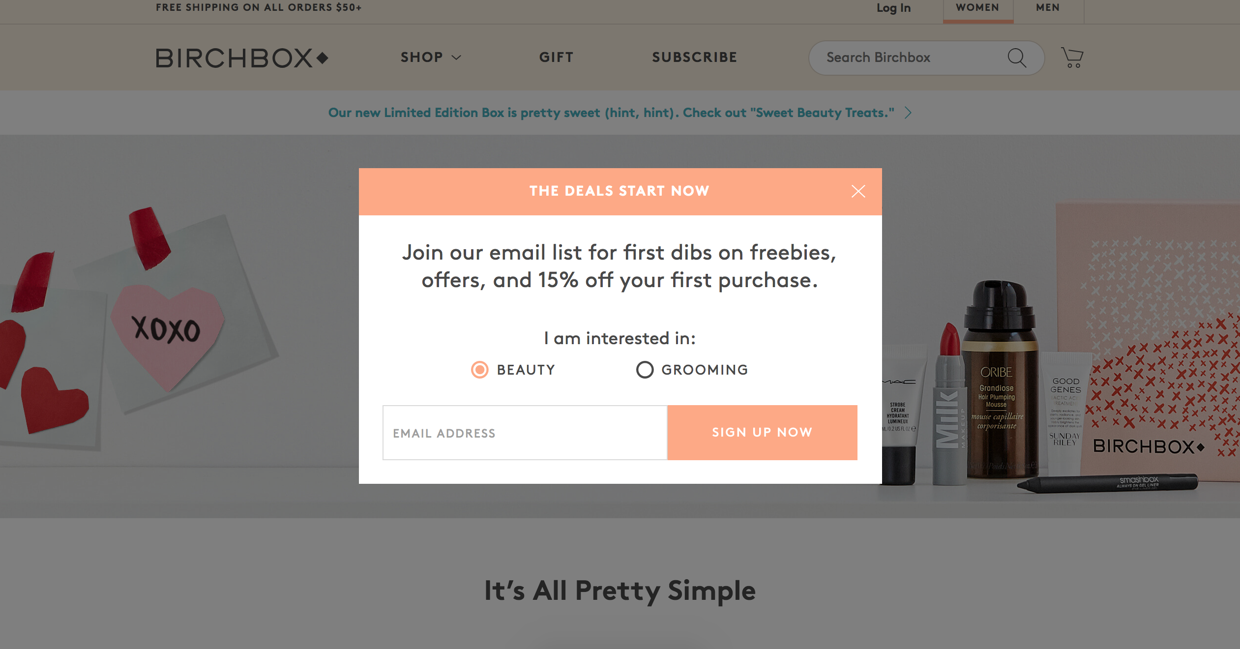
Users are immediately greeted with a pop-up box soliciting an email sign up. This pop up puts customers several clicks away from their desired page and asks for personal information from a consumer who may not be familiar with the brand.

Tentree site visitors are initially greeted with a full-page takeover of the site. This pop up functions as a gate between the user and the content they’re trying to reach and can turn off visitors.
Good “ad” executions: adidas
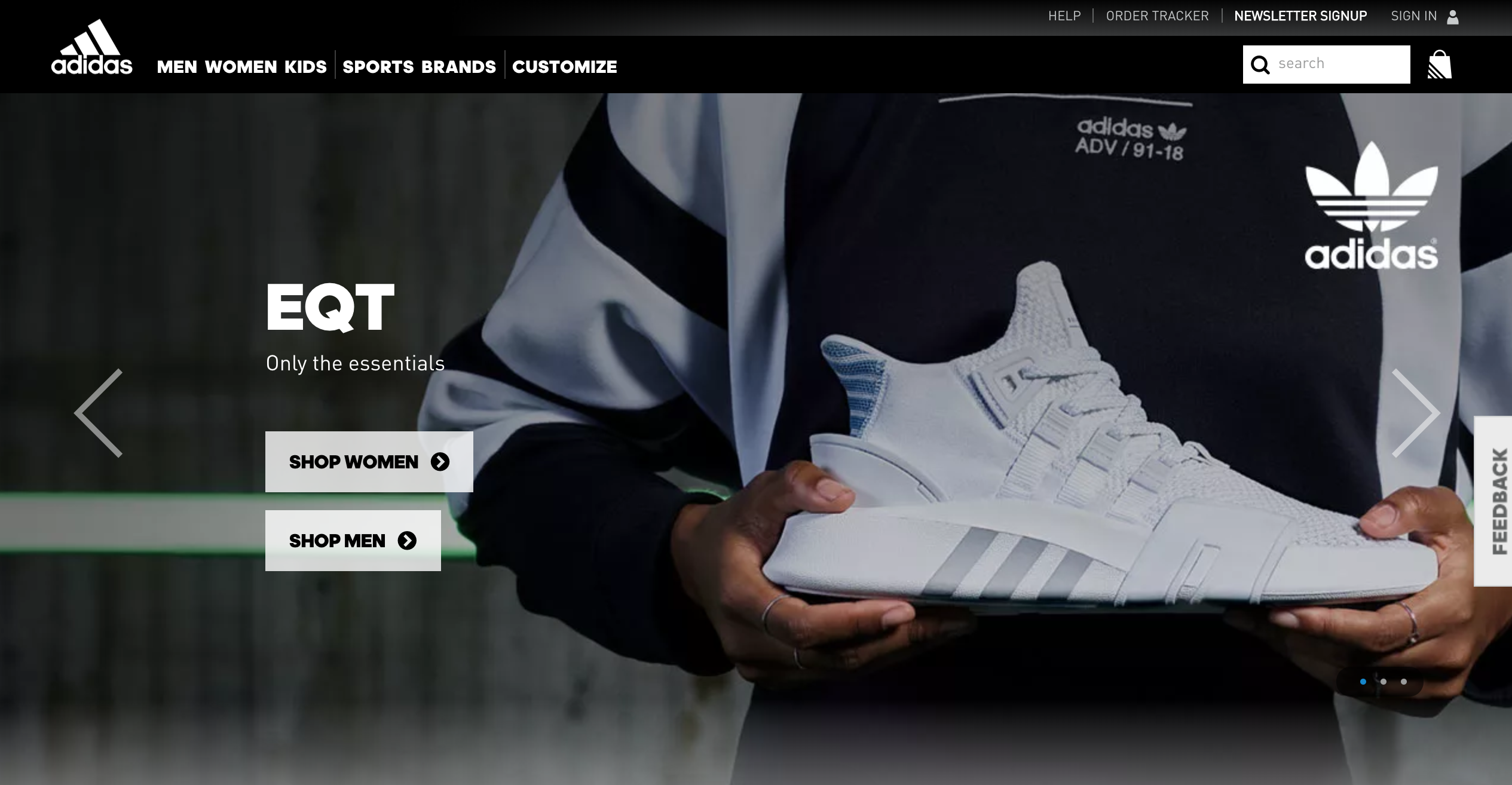
adidas uses clean design, photography and CTAs to engage with users. There are no big promotional ads or pop-up boxes.
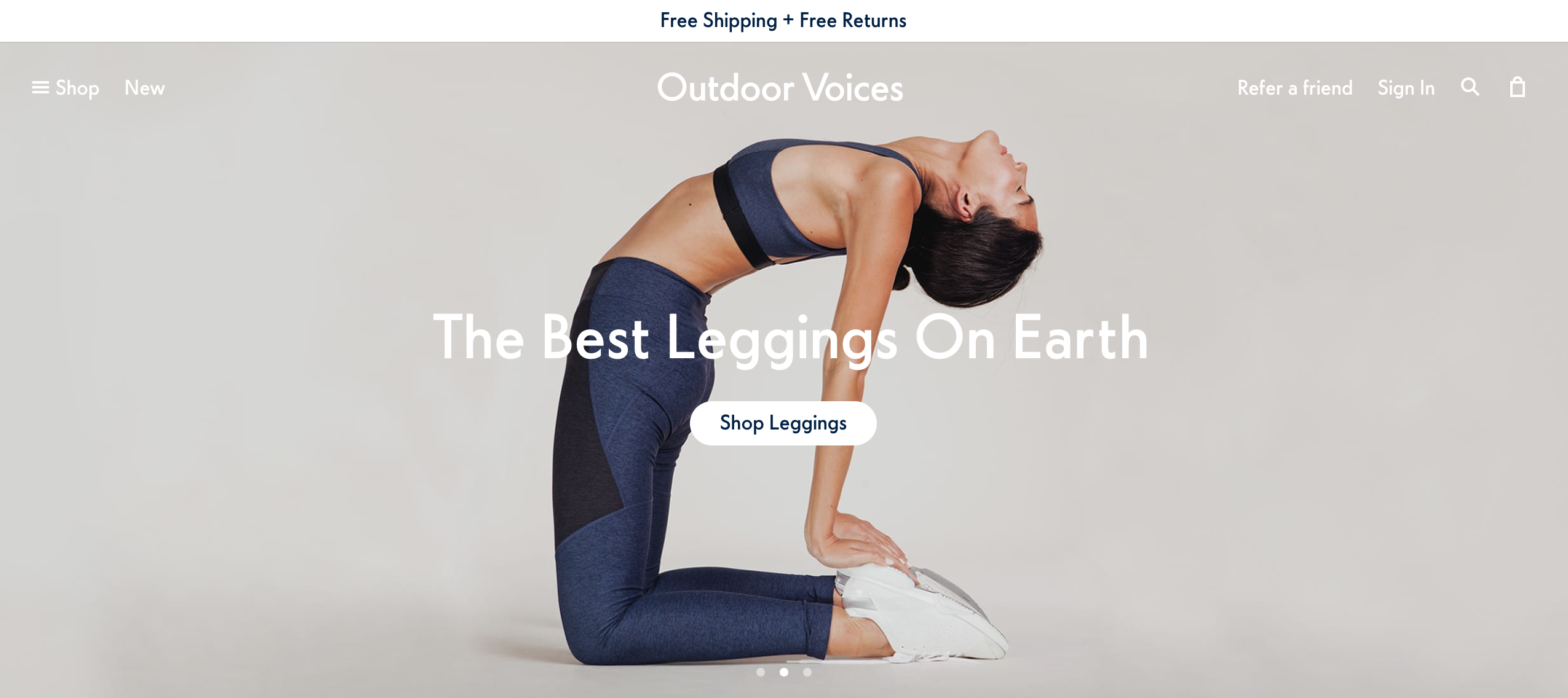
Outdoor Voices uses their homepage for product features and carousel images while still offering deals in a non-disruptive way (see the “Free Shipping” note at the top of the page).
Carousels offer a clean, effective way to feature different products and promotions. However, when combined with autorotation, this common tool presents several challenges.
Autorotation poses readability and redirection problems for the customer. To combat these issues, carousels should:
Poor carousel interactions:Mindy Mae’s Market

Mindy Mae’s Market features an auto-rotating carousel that rotates at a good pace but does not pause when hovered over or stop rotation after interaction.
Well-executed carousel: Converse
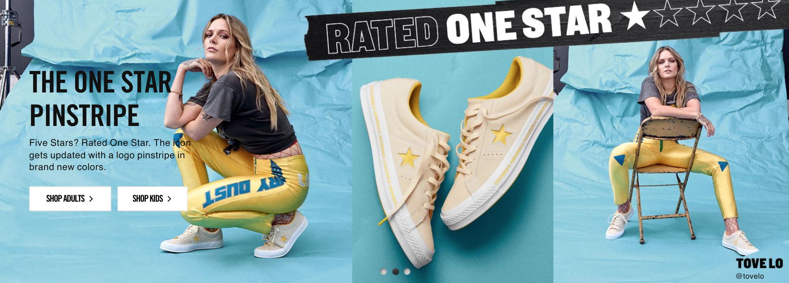
Converse adheres to correct carousel standards. Slides rotate at appropriate intervals, pause when hovered over and rotation stops after interaction.
Filtering and organization is key to good UX. Consumers should be able to easily navigate away from the homepage. Oversimplified or undefined filtering methods may lead users to a page or product they weren’t looking for, which causes frustration and abandonment.
Effective organization means:
Example of poor filtering: Beats by Dre
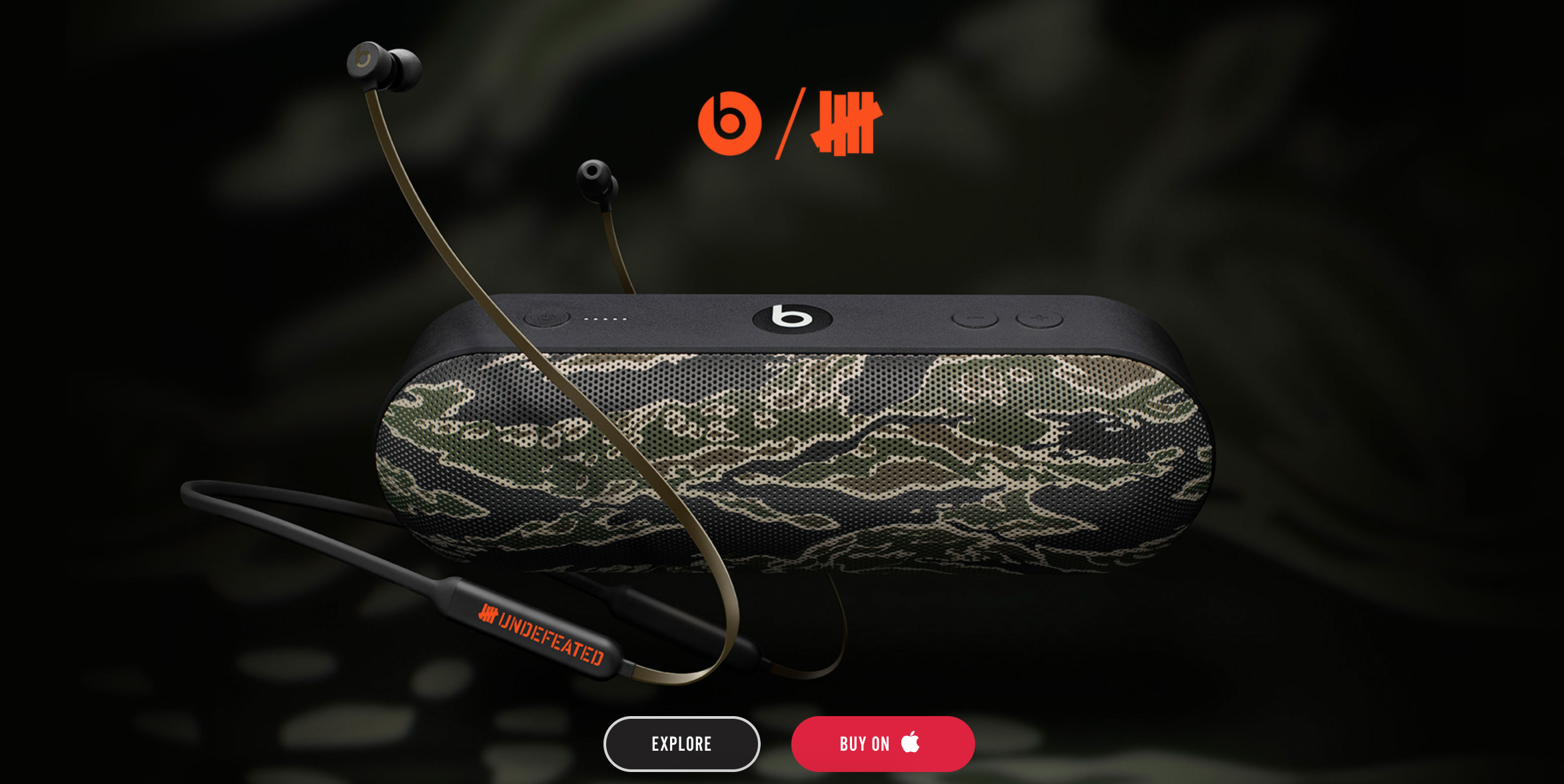
Beats by Dre may have a sleek look, but they only feature specific products and do not mention or link to various categories.
Examples of effective filtering: Reebok


Reebok effectively features different categories, like CrossFit® and UFC, and offers various filtering methods in the page header.
Some visitors know exactly what they are searching for and how to find it on your site, so your main nav should load instantly and before other content.
It’s crucial your website accommodates return customer behavior with thoughtful design and better loading times. This can be achieved with HTML content ordering — prioritizing these elements in the code to be displayed before the rest of the page has been downloaded — or asynchronous loading– ensure these elements load quickly with other featured homepage elements.
Examples of effective loading order: Nordstrom
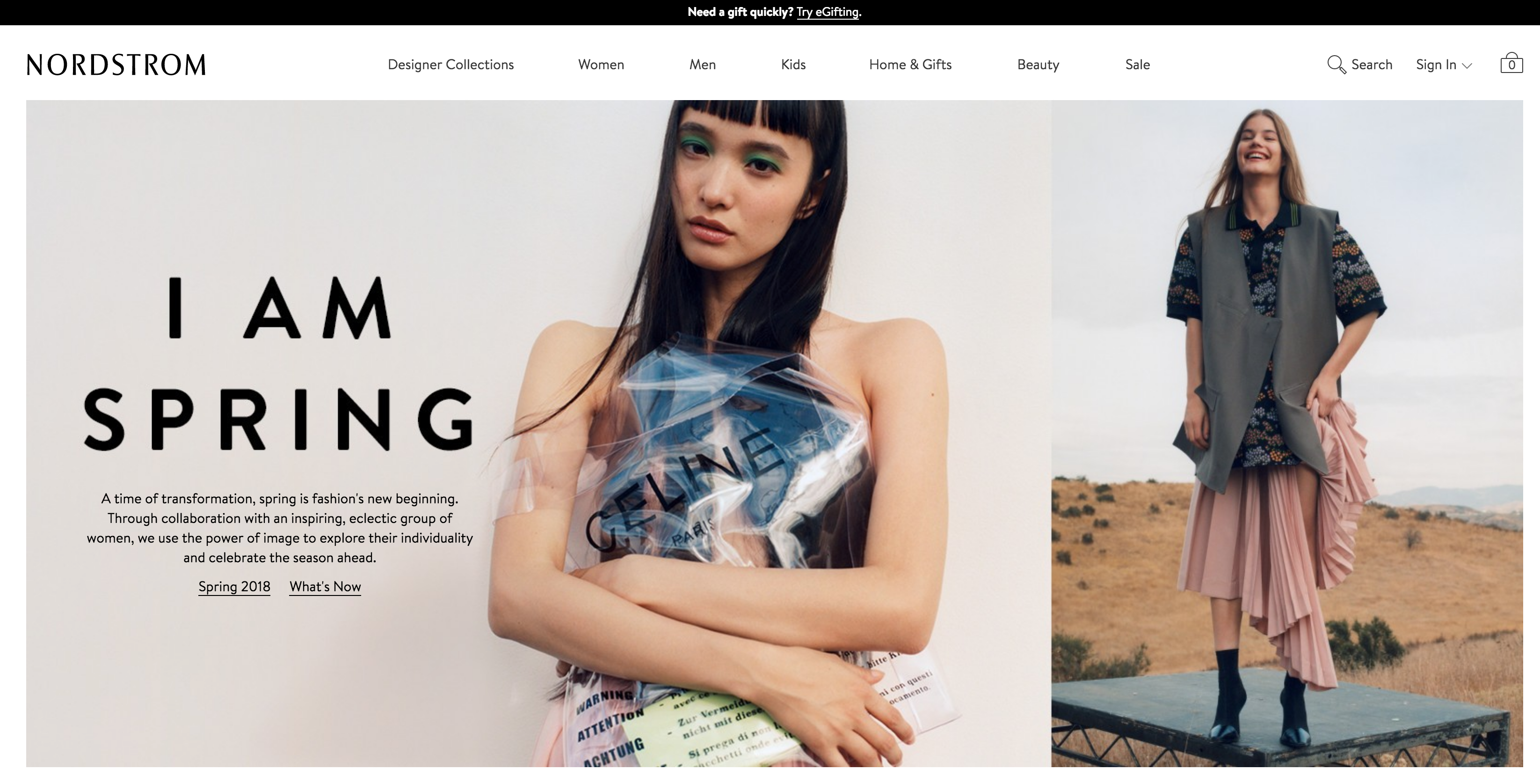
In each example, the main navigation and search functions load either before or at the same time as the page. This gives users quick access to the action they need.
Your homepage is your first shot at making a good impression, and even small errors can lead to customer frustration or site abandonment. If you need help overcoming homepage challenges or advice on how to optimize your homepage, contact VOLTAGE at 303-664-1687 or email us at info@voltagead.com.
VOLTAGE is a creative agency specializing in giving your business a leg up in a performance driven world. Through brand design, creative strategy, and execution, we can drive results for your marketing.

Bikes. Boxing. Blue hair.
View More Articles by AllieWe’re future-izing your inbox! Say hello to our weekly Future Commerce newsletter.

There’s a lot happening at Facebook. Here’s our take on how to protect your business.