6 tips for managing creative teams
If you manage a creative team, read on to make the most of their imaginative minds.


Whether you start from scratch or overhaul what you’ve got, we have need-to-know terms (and results!) for eCommerce construction.
Starting your new eComm store? Or does your site demand a makeover? Whether you start from scratch or overhaul what you’ve got, we have need-to-know terms (and results!) for eCommerce construction.
Let’s take a look at a recent website renewal we did for our fantastic client, Diono. In the first three months of their new site launch, Diono experienced:
A navigation bar, unfortunately, doesn’t resemble anything close to a juice bar. Instead, it looks like a set of text or icons that link to other pages of your site. The nav bar, located at the top or side of every page, consistently displays a visitor’s site location from page to page. The navigation bar helps visitors find what their next purchase on your site.
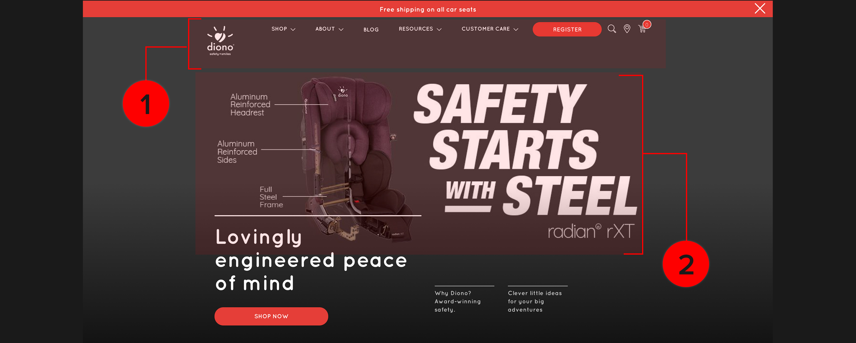
Diono’s drop-down navigation bar expands into more detailed categories to keep the look simple without taking away key functionality – sleek and user friendly.
The hero image functions as the Superman visual of a site. It’s bold, striking, tied to a key product, or representative of the brand. In Diono’s example below, this hero image emphasizes their most important message and differentiator: safety from steel.
Now for banners. No, not like House Stark’s banners from Game of Thrones. Banners can serve a similar function as hero images – with two or more banners creating a slider. They slide across the top of your web page displaying offers, new products, and exciting promotions. You can click a slider image to see the advertised promotion.
In addition to sliders, when we talk about banners we also mean a banner ad. You’ll recognize a banner ad as a clickable rectangular image displayed at the top or side of someone else’s website for advertising. Use banner ads to:
A landing page has a very specific set of skills – like Liam Neeson in Taken… sort of. A landing page either collects visitor info for marketing purposes or warms them up for the next web page you want them to see.
The first type of landing page collects info (email, name, phone number, etc.), via an online form, in exchange for customer-valued information. Use landing pages and these visitor details to better your marketing efforts and connect with your audience.
Exchange visitor information for something worth the personal information you “charge” them. Our ideas include:
The other type of landing page prepares visitors for the next step in the buyer’s journey by informing them about your product or service. On this page, make it clear what you’re offering and then add a CTA. Another example: summarize your service before asking them to sign up for a free trial. Informed visitors are more confident and willing to try your offer.
Either way, the landing page focuses visitors’ attention, and no other content should distract them from the task at hand. A minimal navigation bar and a lack of pop-ups can help focus visitors’ attention.
Unfortunately, CLP doesn’t stand for a Continuously Licking Puppies. It does stand for Category Landing Page, which introduces a category of products to visitors. The product images on this category page link to the products themselves. Easy, right?
On Diono’s site, the Car Seats CLP includes a hero image, a selection of the car seats they offer, and awards that their products have won. Impressive!
Pages like this aid in site navigation and allow site visitors easier access to essential pages on your eComm store. CLPs also help visitors find products easier via a Google search. CLPs help eComm sites with lots of products, but smaller stores can also benefit from a clear CLP.
As an example, the results of a “Diono car seats” Google search could yield links to all the product pages, plus their category page. The more results for your site on a Google search, the better.
Help visitors sort their options with a product listing page – aka product landing page (PLP). A PLP lists all products within a category or products that have been filtered. It usually offers additional controls, for example:
On Diono’s All-In-One Convertibles PLP, you can filter by category, date, and price (high to low or low to high). You can also search by popularity, giving visitors an idea of what makes your brand special.
The Holy Grail of eCommerce! The product detail page (PDP) shows visitors a product’s details (like size, color, and features). The “Buy” button is located on this page. Visitors take action to buy your product or service on the PDP. Visitors better have all the information they need on this page to make a final purchase decision. Use a combination of copy and visuals to deliver essential details.
Diono’s rainer PDP has a white or a light hue of red. The colors that pop are limited to pictures, videos, and the “Add to cart” button. This design detail focuses visitors’ attention on the product and highlights the purchase CTA (make this clear and easy to click!!!). The design removes fancy distractions and gets your shopper to yes!
Your outlet for blogs, posts, and articles listed on a post landing page (not the same as a PLP). Diono filters its posts so visitors can easily find safety stories, tips and advice, product news, or view all of Diono’s posts.
It’s a party here! Host a blog, a piece of content, or an article on your post detail page (not the same as a PDP). This content can attract visitors to your eCommerce site via social media shares, educate visitors about your product or service, and convince them to purchase. Diono’s content focuses on topics specific to its parental audience.
The footer: near the bottom of our checklist – but not at the bottom of the totem pole. A footer, located at the very bottom of a site, fills voids like:
Pop-ups pop-up in front of the screen when you visit a site. They can keep a visitor’s eyes on the screen while the rest of the page loads. Use pop-ups to:
In our example, Diono offers a discount on the next order in exchange for a newsletter subscription. Visitors see this. They may not find it spectacular or entertaining, but some will enter their email. Truth is, visitors really really don’t like pop-ups, but this tool does work. Whether you think of pop-ups as worn out, effective, or a bit of both, we suggest testing them.
A high-performing site will optimize all these pages with quality design and a simple yet strategic layout. It takes thought, patience, and practice, but an eCommerce site that works effectively will pay for itself.
For more online anatomy or information call 303-664-1687 or email us at info@voltagead.com.
VOLTAGE is a digital agency specializing in eCommerce, digital brand experiences, and web apps. Get emails and insights from our team:

If you manage a creative team, read on to make the most of their imaginative minds.

Why is it fun to work at Voltage? Oh, let us count the ways.