Logo & Identity Design by VOLTAGE: A Round-Up of Recent Work
Understanding the business needs, audience, and goals of our partners is paramount to delivering a logo that will live on – and stay relevant – for years to come.
There’s something about a logo project that really turns on the lightning around here. While sometimes brands come to us with a new business idea that needs to catch eyes, other times we’re tasked with a rebrand that involves a careful evolution of existing elements. And while a great logo may sizzle, it’s just as much an exercise in strategy and simplicity. The selections you see below are the outcomes of competitive and industry research, inspiration-gathering, sketching, and team reviews. Some of them you may even spot around Boulder!
Worth noting: A logo is just one piece of a cohesive brand strategy. Stay tuned for a post on why you need a full brand strategy before you even think about a logo…
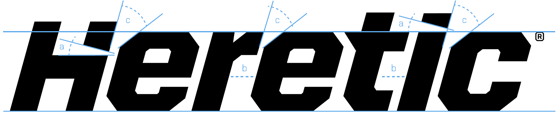
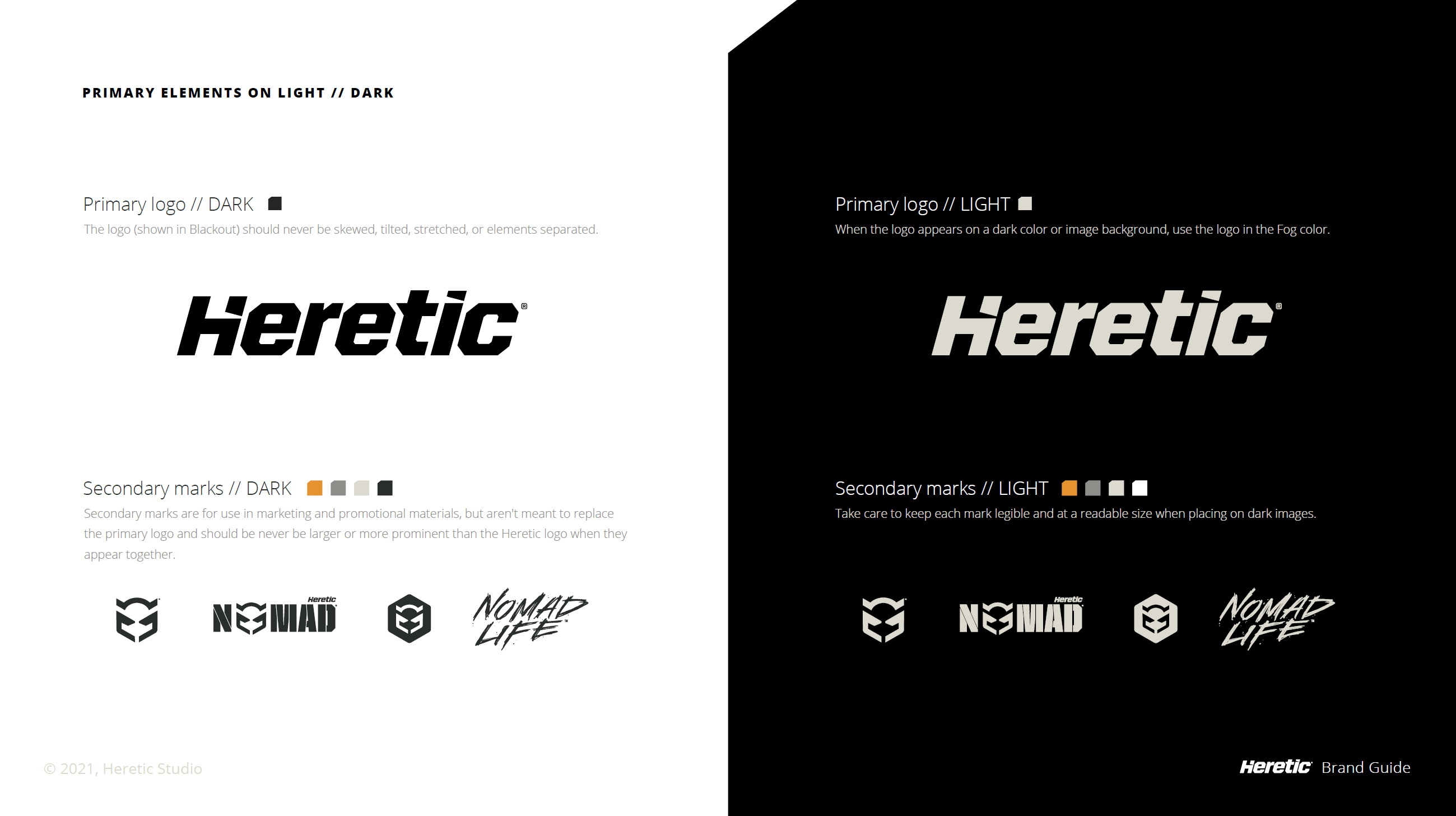
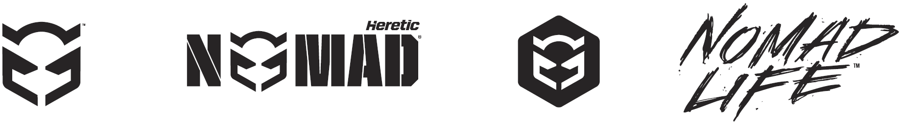
Heretic Studio
The Heretic Studio logo shows the off-road space who’s boss. Action-oriented typography and a hefty weight is a power play that’s practical across both product and packaging. An angular approach ties in the brand’s iconic product design and shape, while distinctive cutouts cut into the dark letterforms like beams of light. Supporting brand elements keep the story going. Light it up →
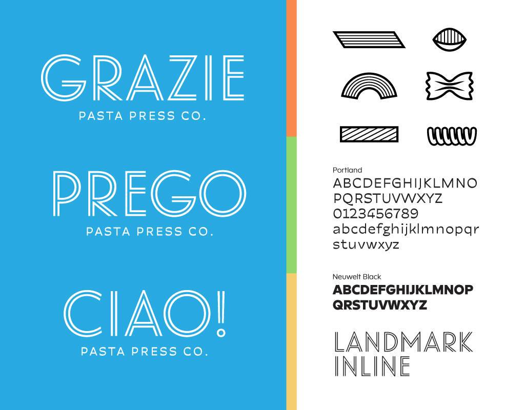
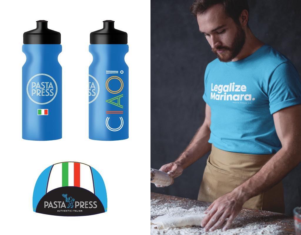
Pasta Press
The fresh look for this fast-casual authentic Italian concept makes the connection between Italy’s appreciation for fine food and good health through cycling. Pasta Press owner Stefano grew up in the shadow of the Dolomites where he cultivated a passion for culture, food, and cycling. Now in bike-loving Boulder, Colorado, it’s a match made in (carb) heaven. Vintage cycling jerseys inspire the colorways, while graphic elements take cues from the past. A lion rampant flies the family flag of scratch-made noodles. Stay tuned for the grand opening →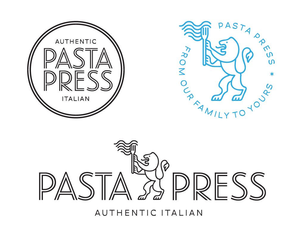
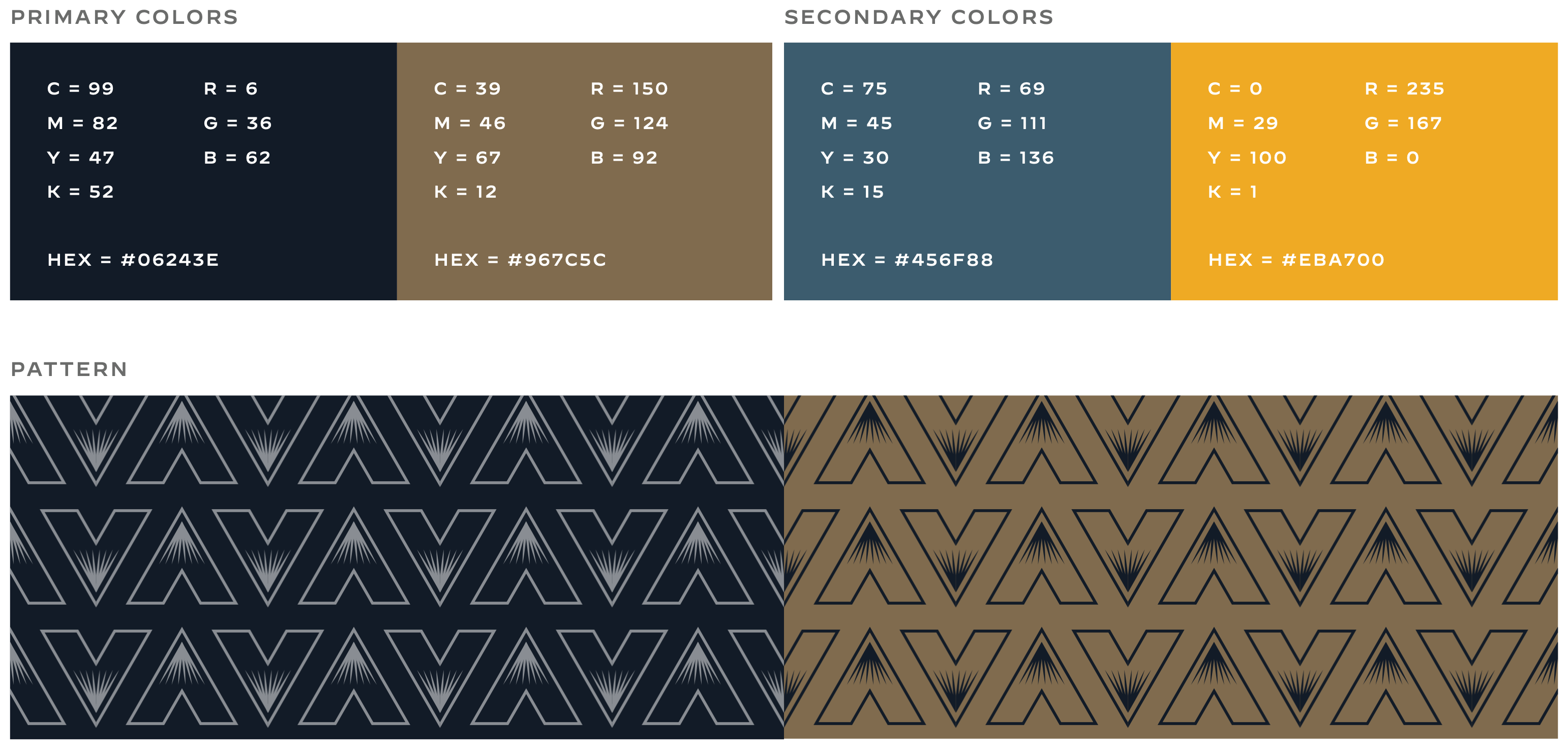
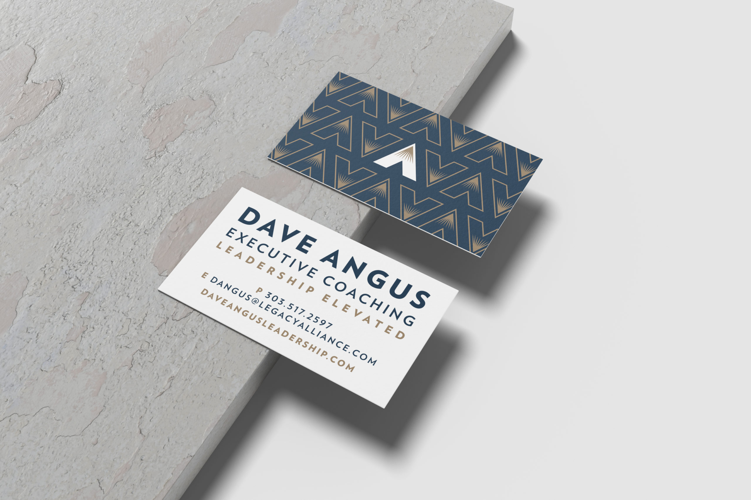
Dave Angus Executive Leadership Coaching
To create an engaging site for Dave Angus, we had to begin with the basics — a bespoke logo and brand elements that would speak to his authority in executive coaching. In our initial discovery session with Dave we learned about his unique approach to coaching that integrates his love of the outdoors. From there, we created a color palette inspired by the Rocky Mountains and paired it with mountain-inspired iconography and a bold typeface. Meet Dave →

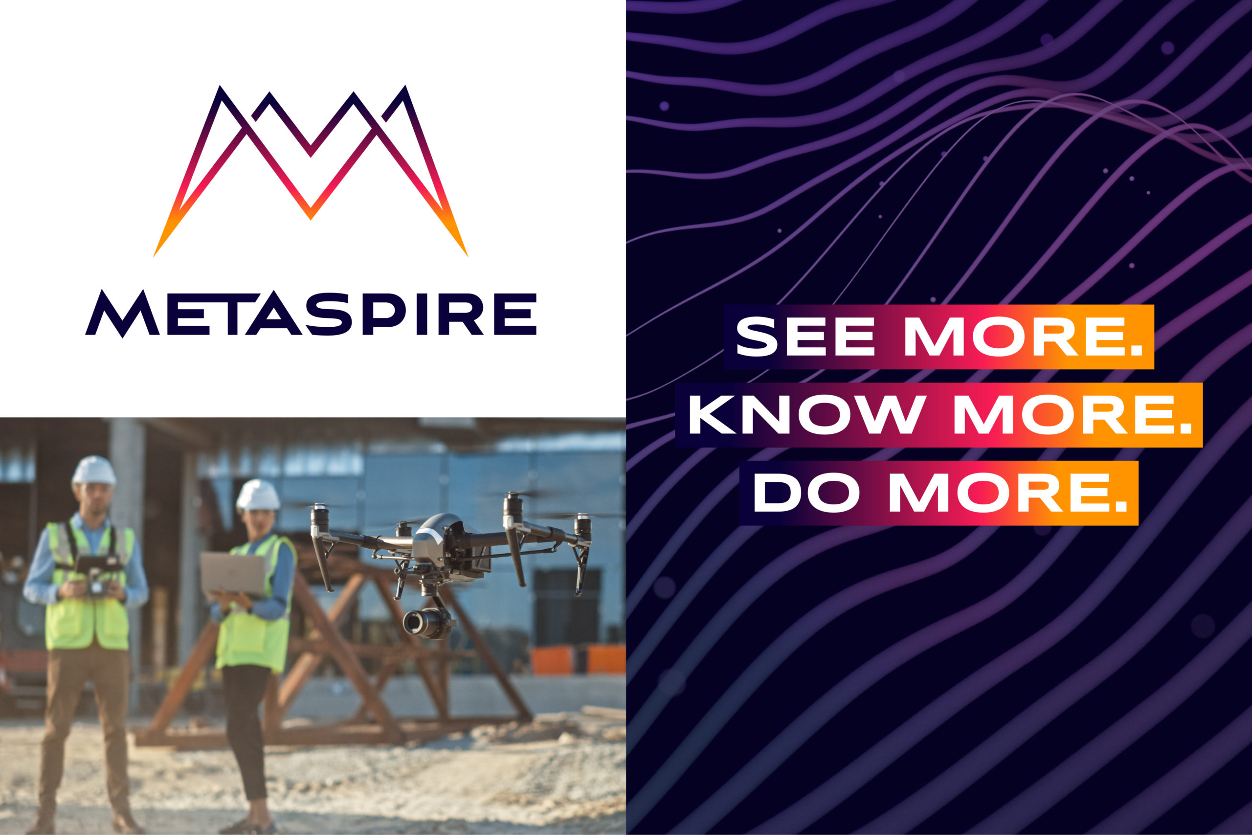
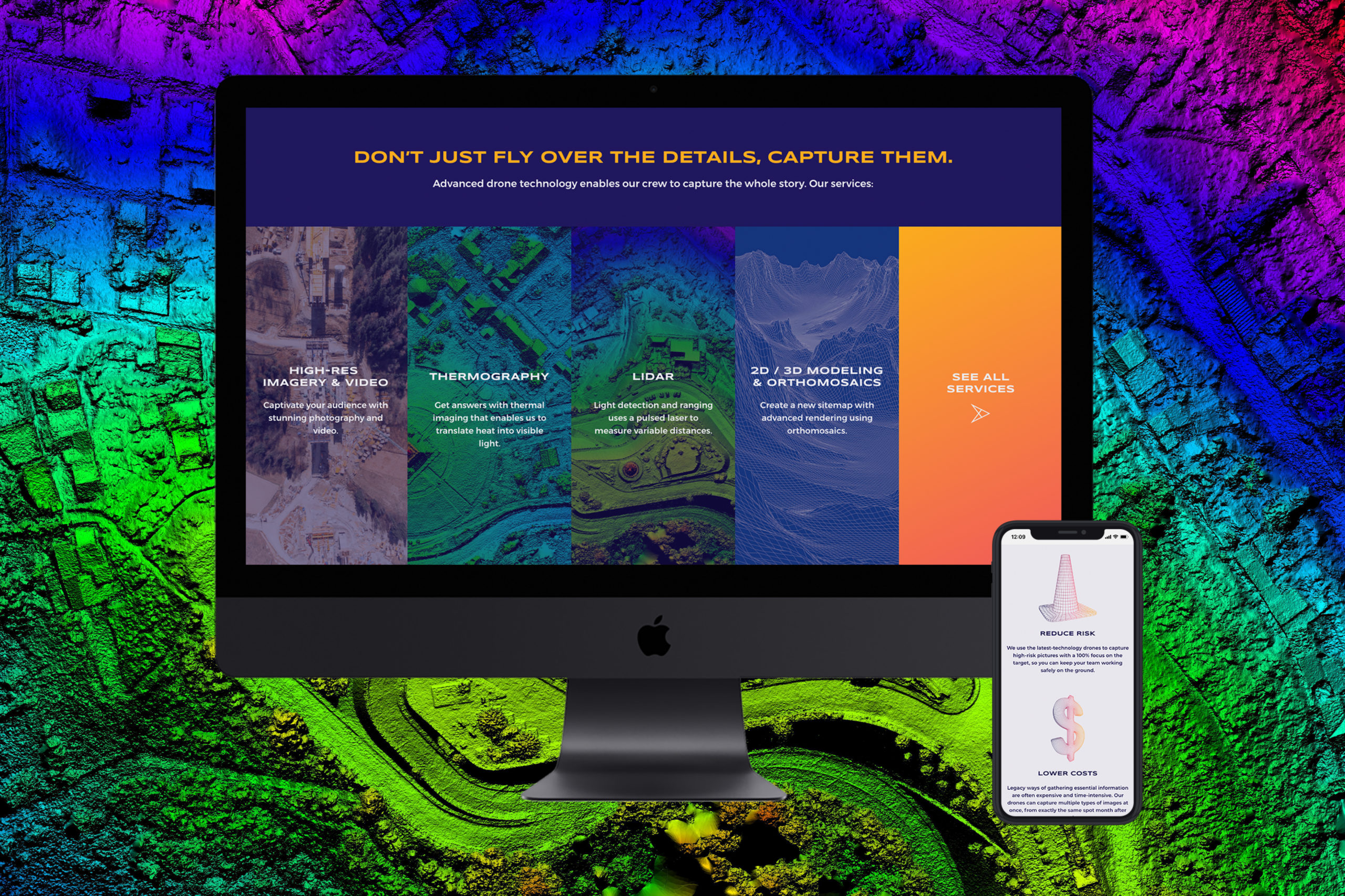
METASPIRE
Drones are taking over the skies, and their potential is near-endless when it comes to capturing data and image mapping. The industrial drone pilots at METASPIRE needed an identity that would quickly rise above their competitors and stand out in the field. Our objective was to capture the sense of wonder, precision, and possibility inherent to the use of drones, while creating a look that could evolve. The final mark, a monogram “M,” evokes the essence of a drone’s shape and is paired with a stylized type treatment and colors inspired by thermographic imaging output. Check it out →
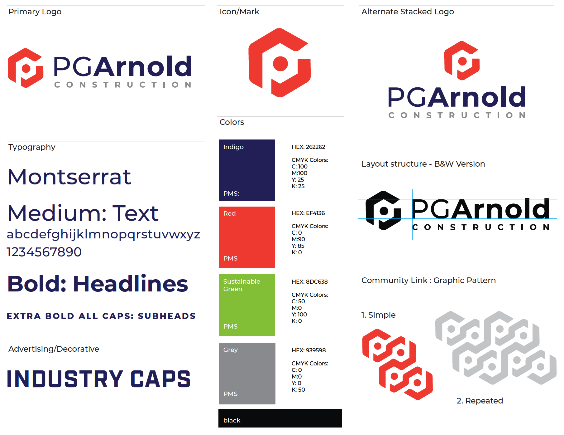
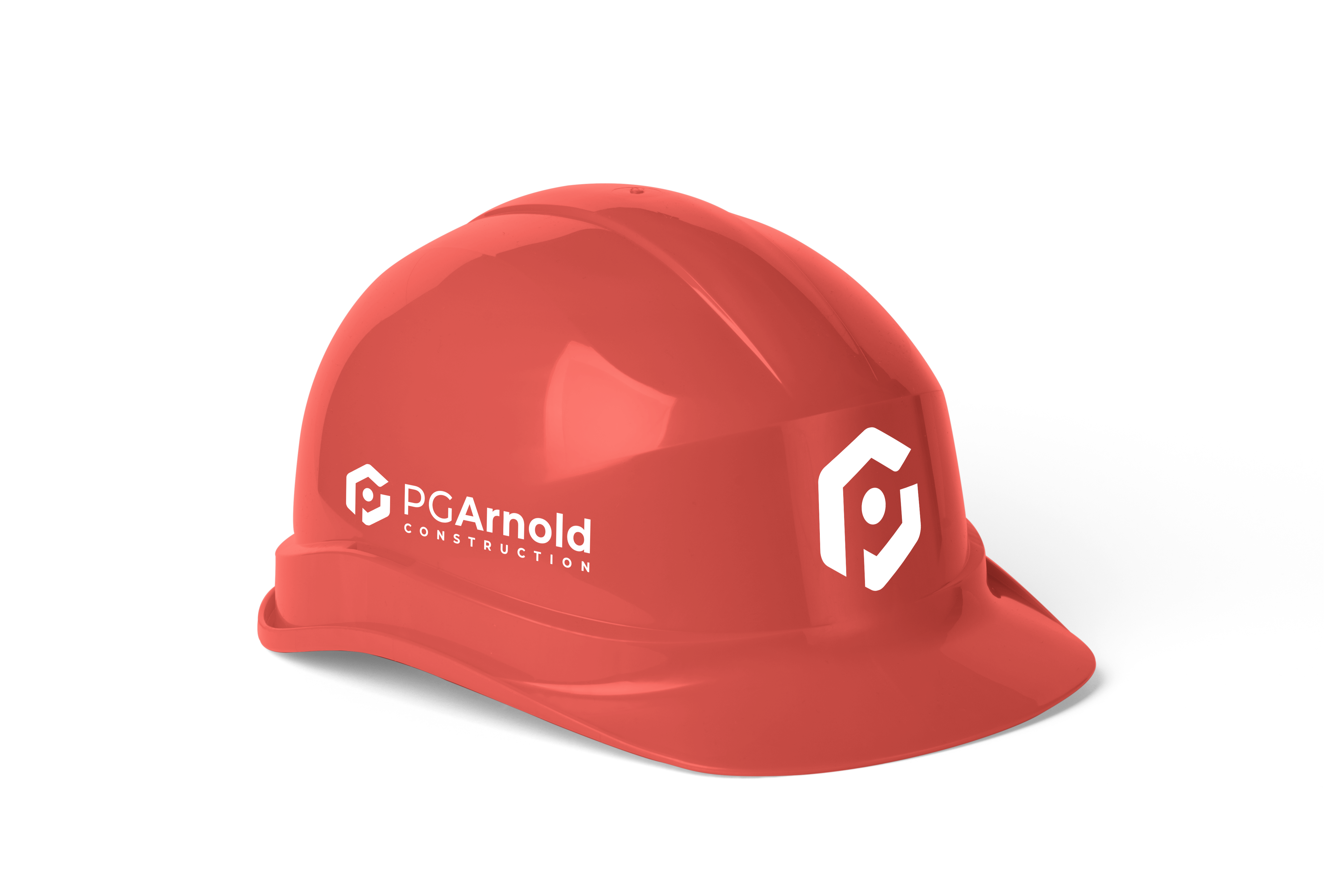
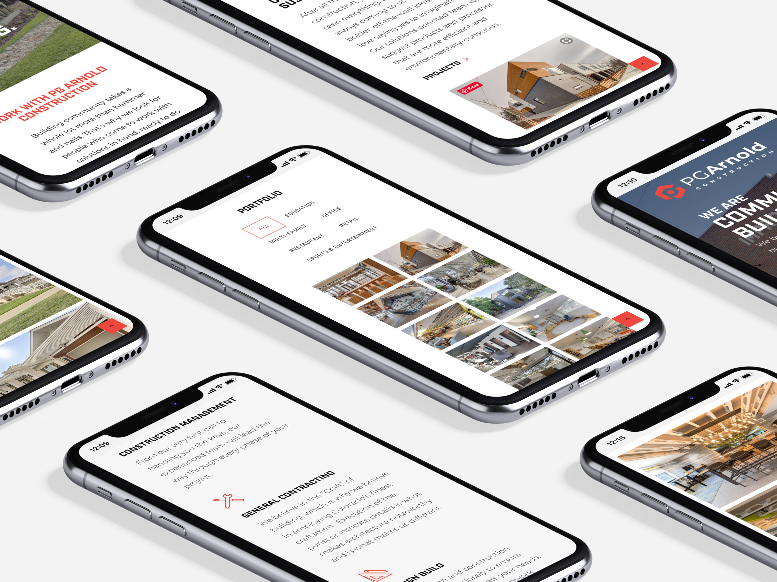
PG Arnold Construction
PG Arnold is one of the most respected builders on the Front Range. They’d had a logo done online, but wanted something with strong local roots. Drawing inspiration from the original design, we simplified elements to make the shape more unique and doused it in a red hue sure to stand out among area construction companies. Read about the rest of the project →
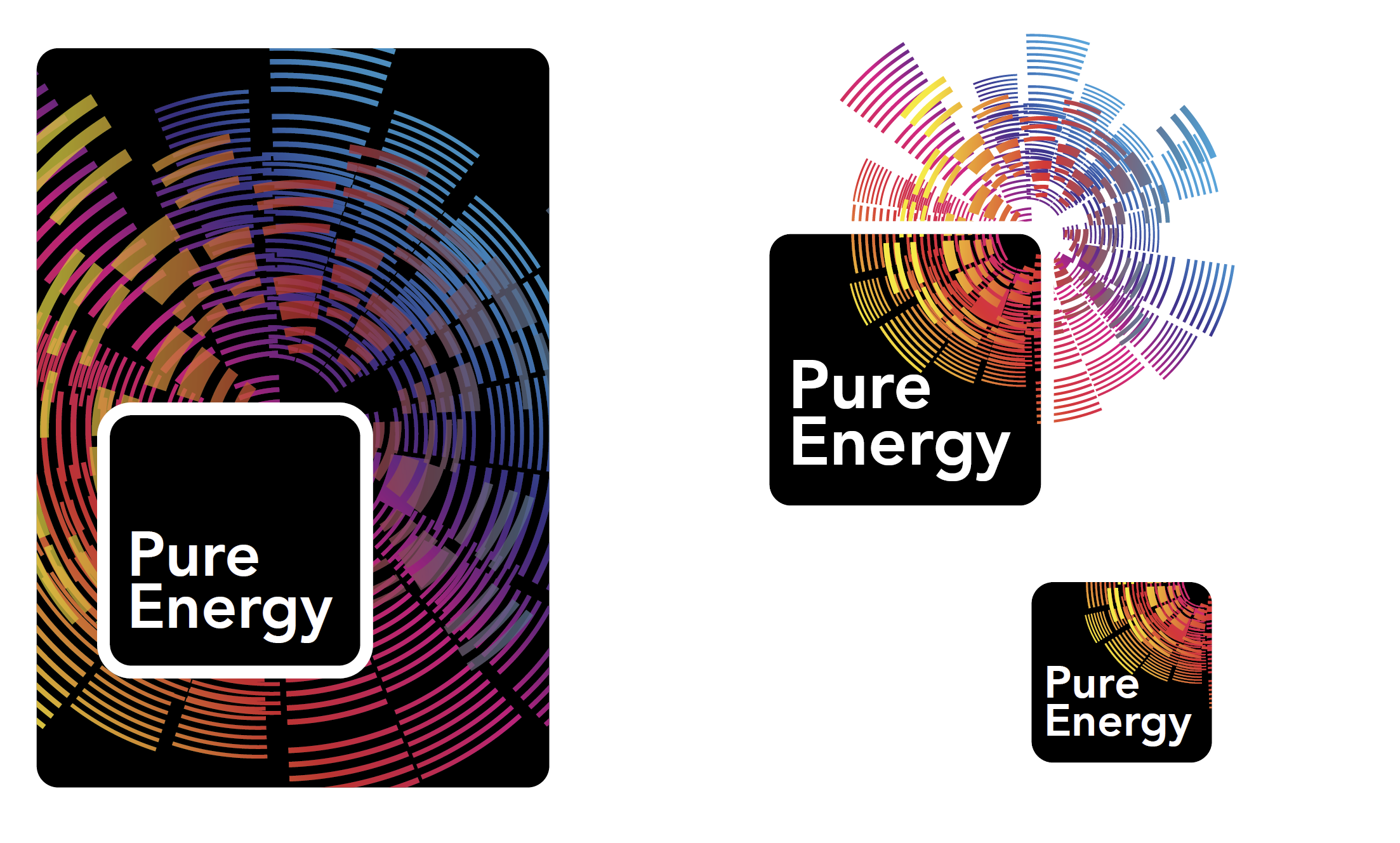
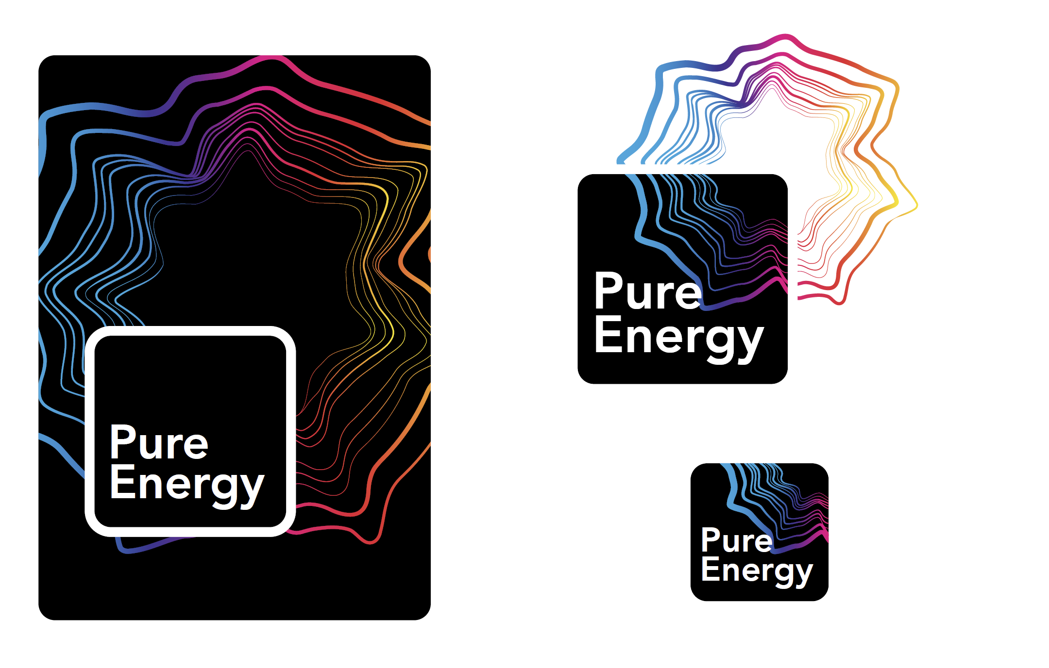
Pure Energy
This pro bono project will serve Young Presidents Organization through 2022-2023. We were tasked with creating a look around the theme of “pure energy” – good energy that powers us, power which moves us, lifts us, and energizes people to perform at our best. To that effect, these concepts were inspired by sound waves and movement.
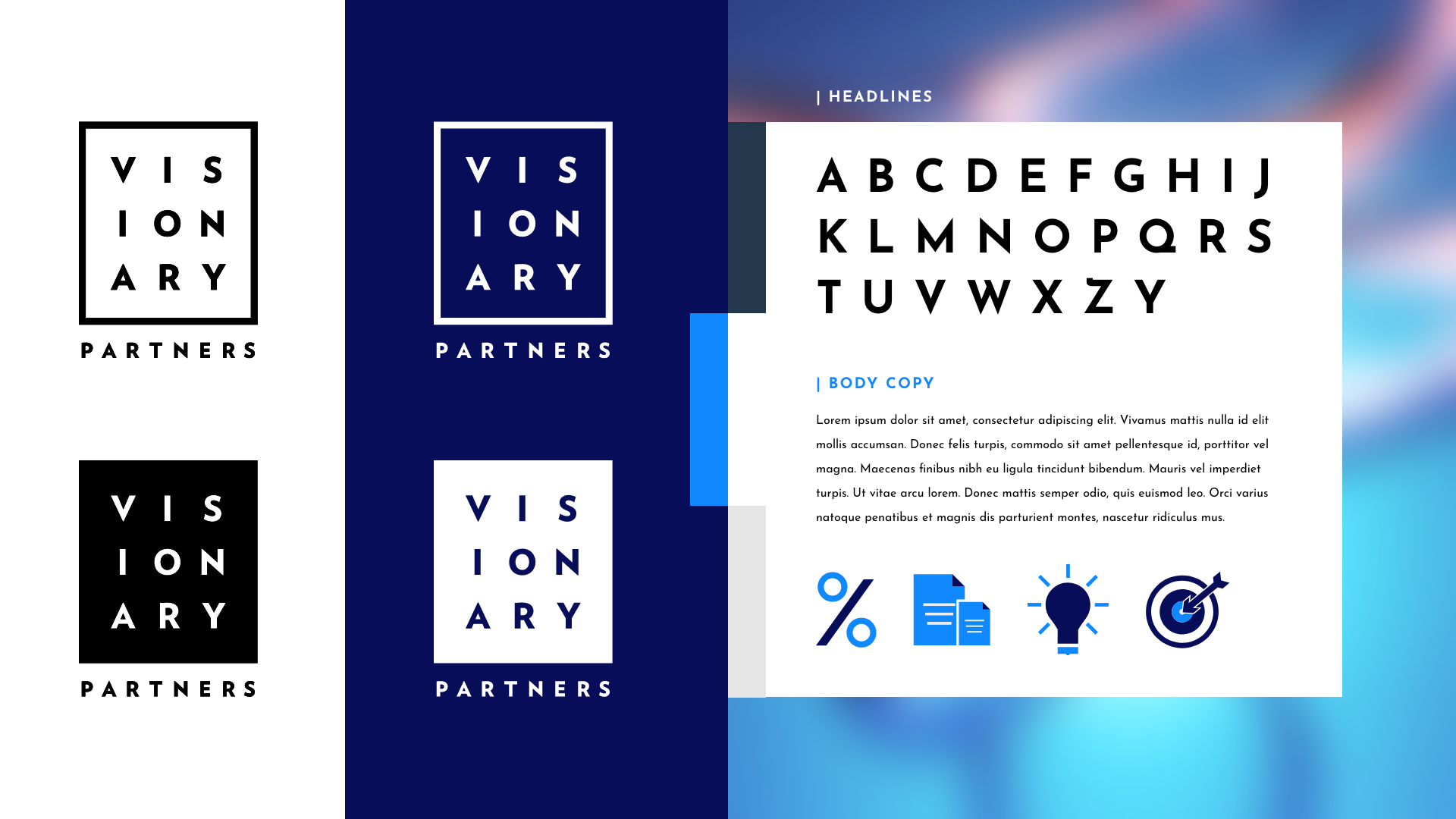
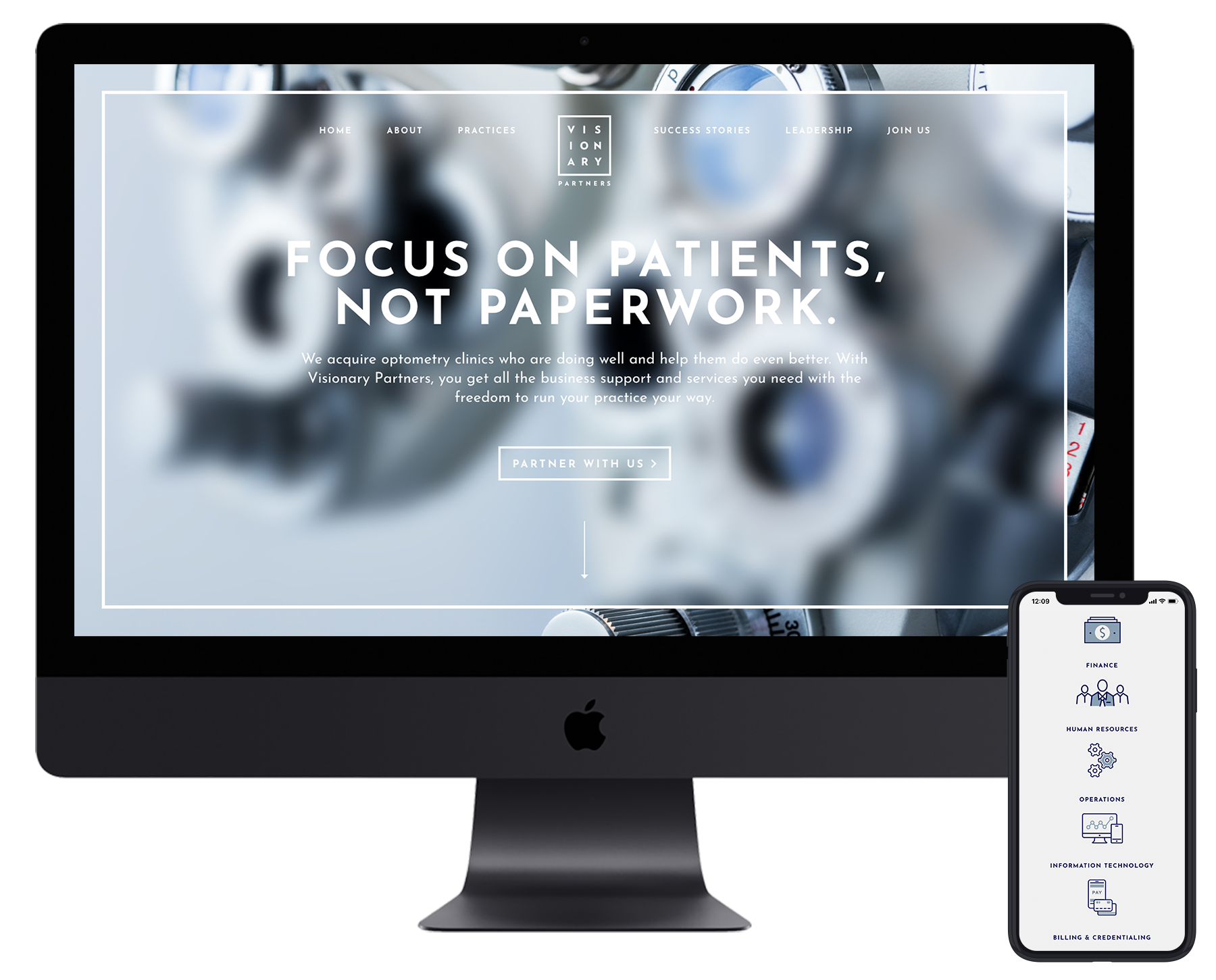
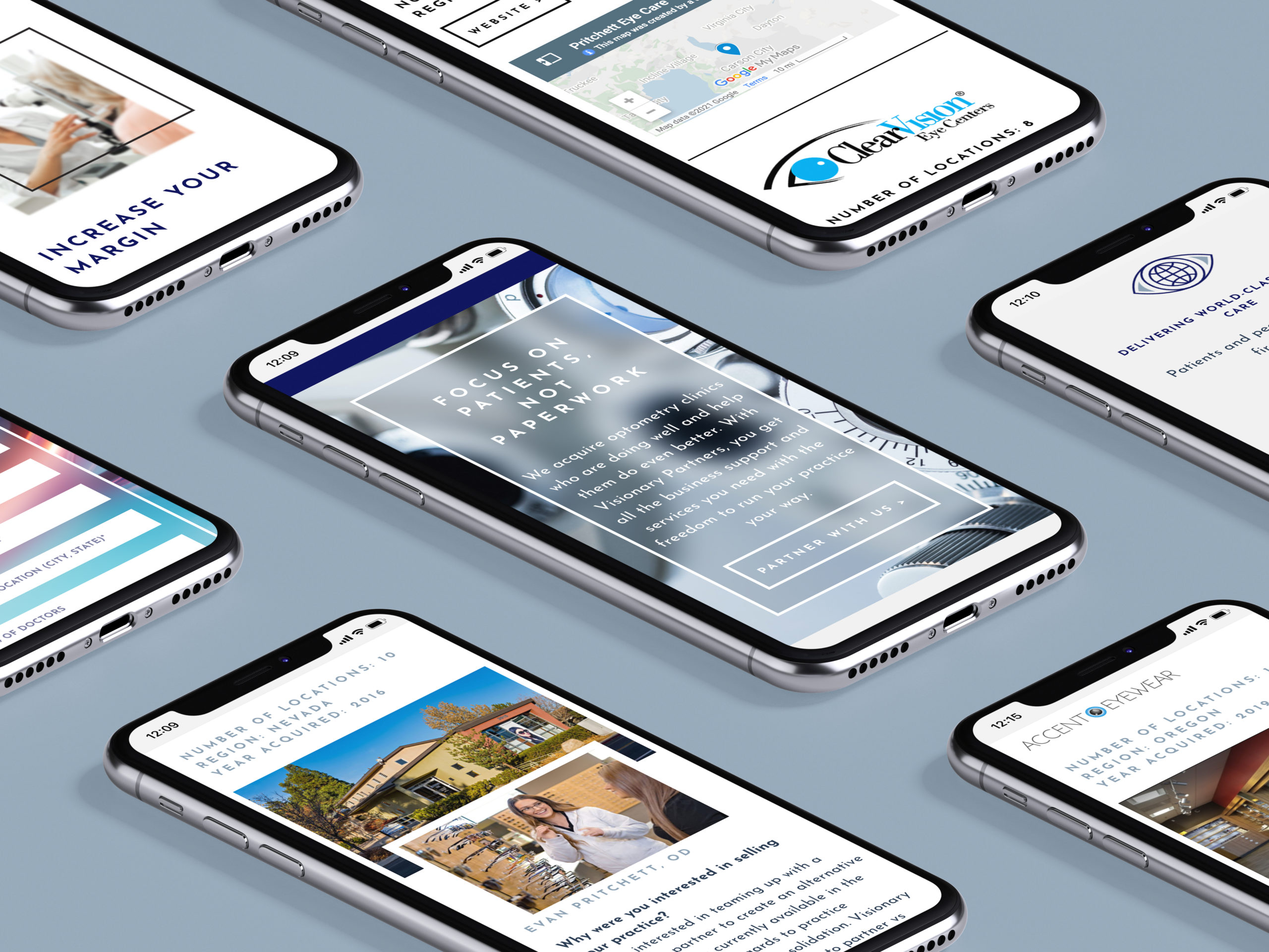
Visionary Partners
As an optometry practice acquisition management team, Visionary Partners needed a look & feel to reflect their professional yet approachable philosophy. We worked up several concepts, all focused on conveying partnership with a nod to vision. The clear winner: a simple yet iconic logo that mimics an eye chart. We brought their new look to life on a fresh WordPress site with color, imagery, and custom icons designed to legitimize their services and help them stand out. See the website →
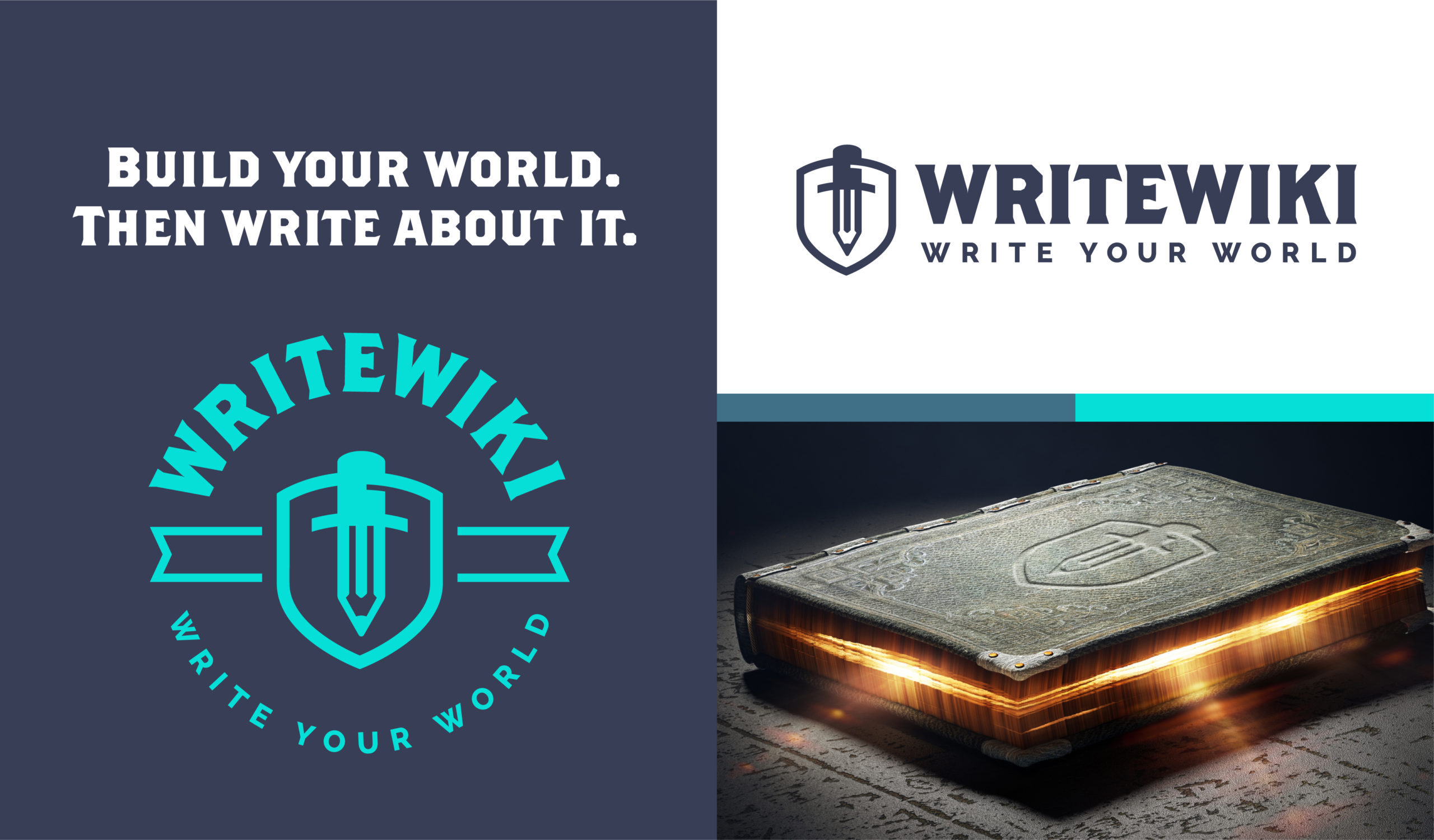
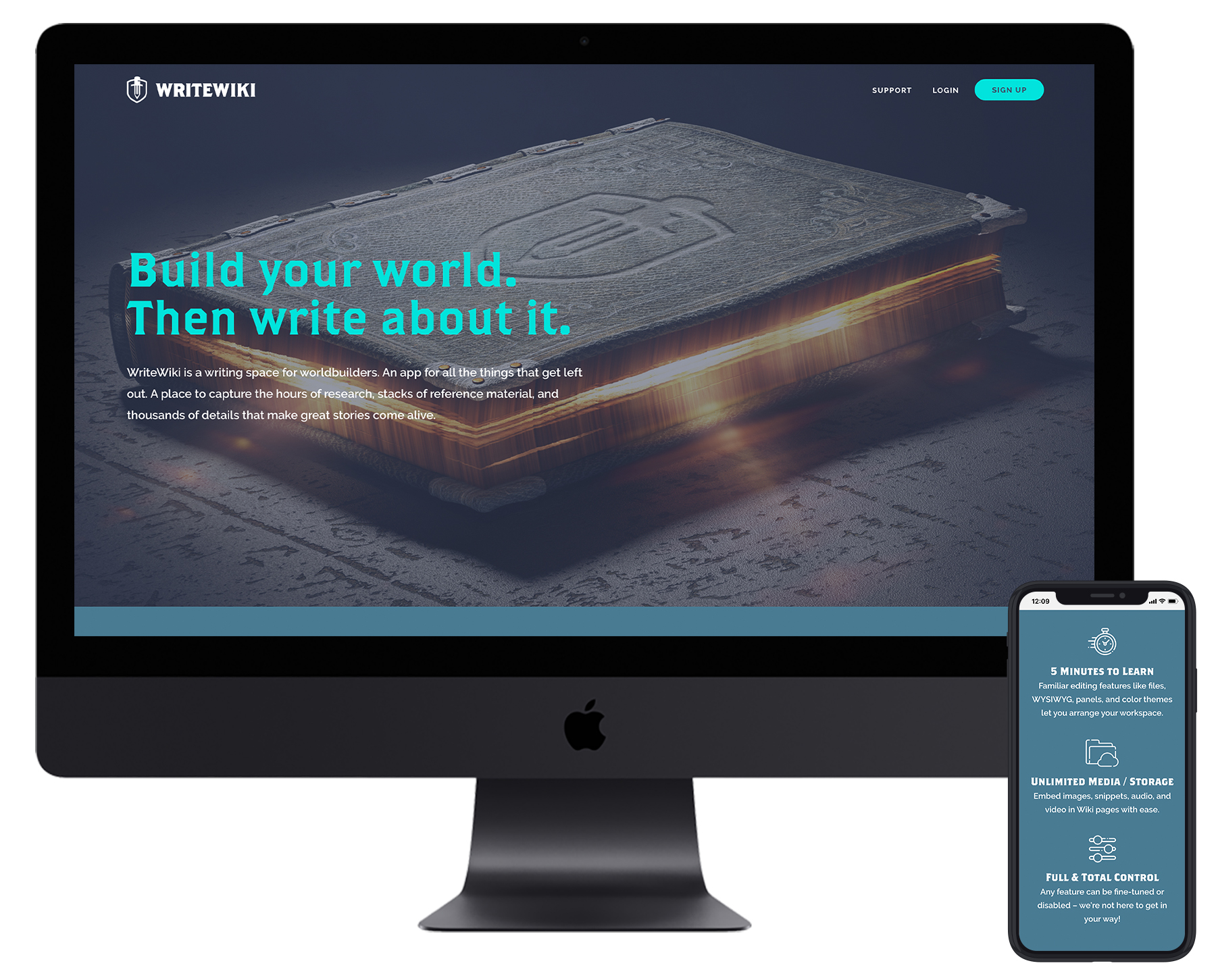
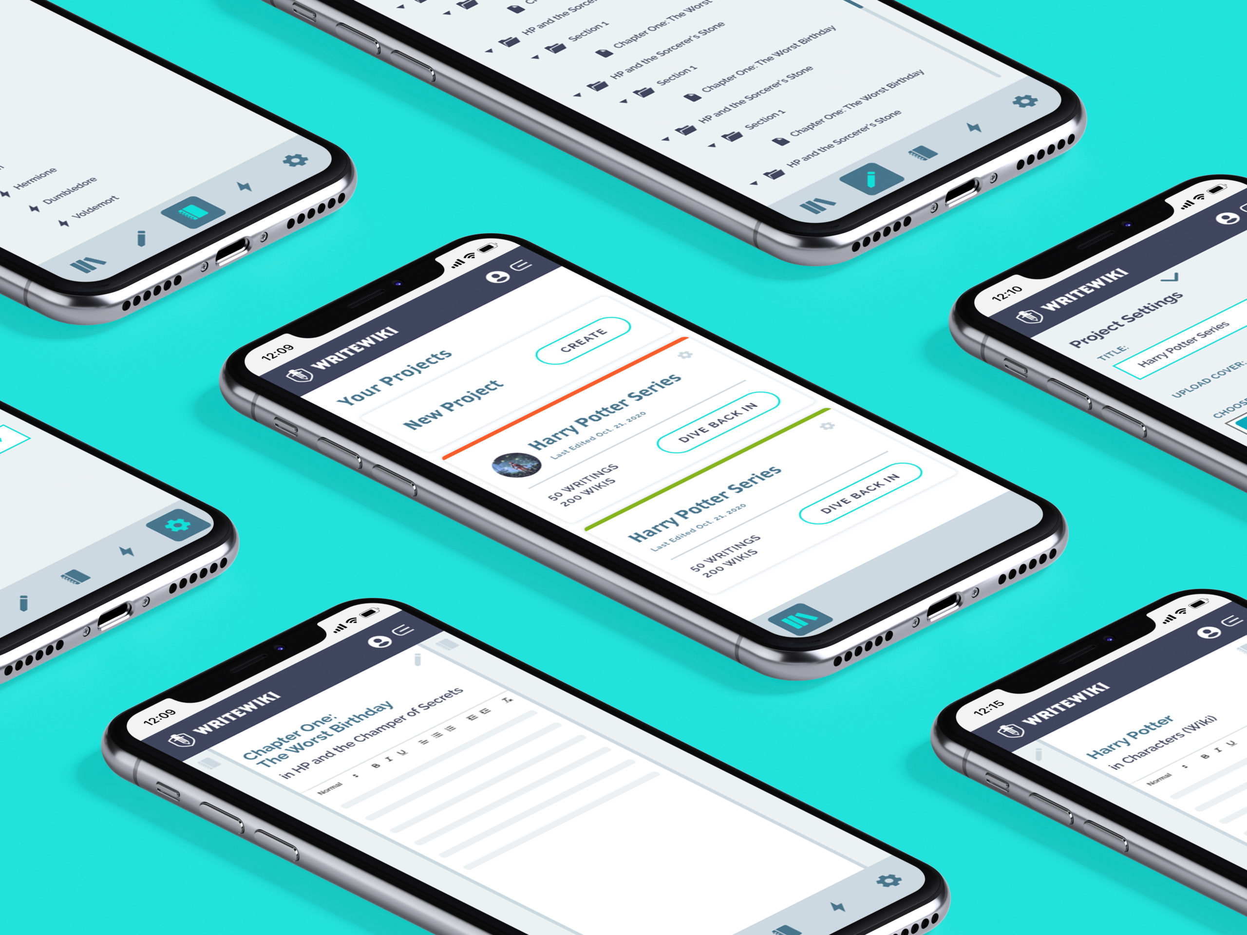
WriteWiki
The pen is mightier than the sword, especially when you’re planning your next novel or Dungeons & Dragons campaign. WriteWiki is a tool that helps fantasy writers, gamers, and anyone with an active imagination detail the worlds they want to create. We used a heavy semi slab font that feels as if it were forged by a blacksmith to evoke images of the worlds writers can forge with WriteWiki. The logomark itself incorporates a pencil that resembles a sword lying on top of a shield. Writers use WriteWiki the way you might use a pencil and a sword, sketching down ideas, chopping off the fat, and refining the pieces of their story as they see fit. (Website coming soon…)
Is your current logo feeling a little lackluster? Give it some sizzle: Email us at info@voltagead.com.