
PG Arnold is one of the most respected builders on the Front Range. They'd had a logo done online, but wanted something with local roots. So, when they came to us looking for a modern website with clean architecture, they handed us the keys to their logo, too.
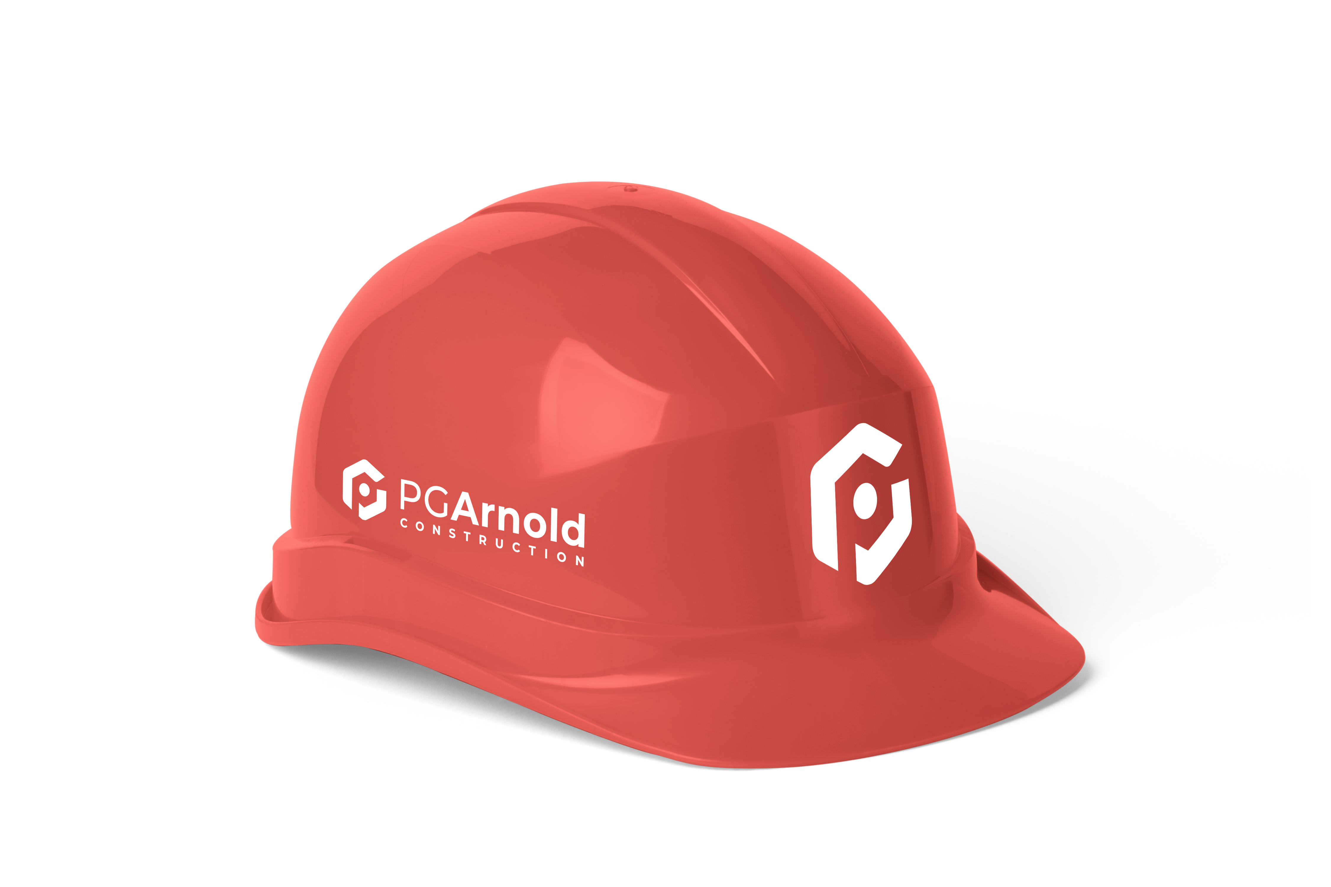
Drawing inspiration from the contest winner's design, we simplified the logo to make the shape more unique and doused it in a red hue sure to stand out among area construction companies.

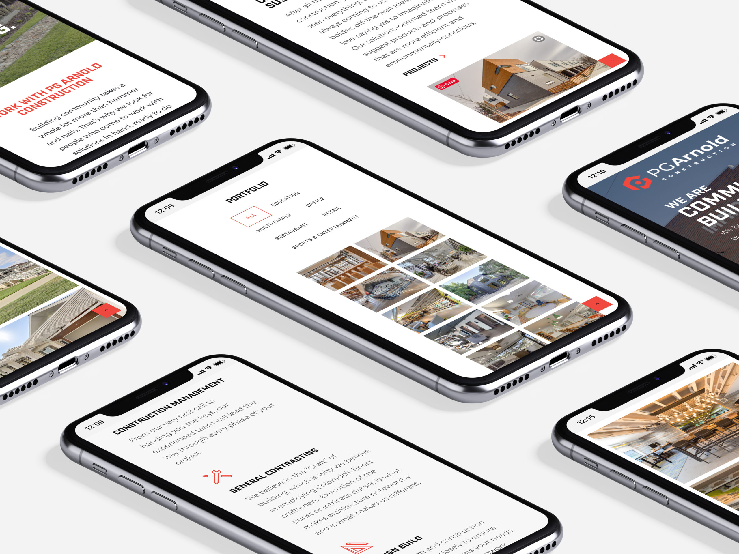
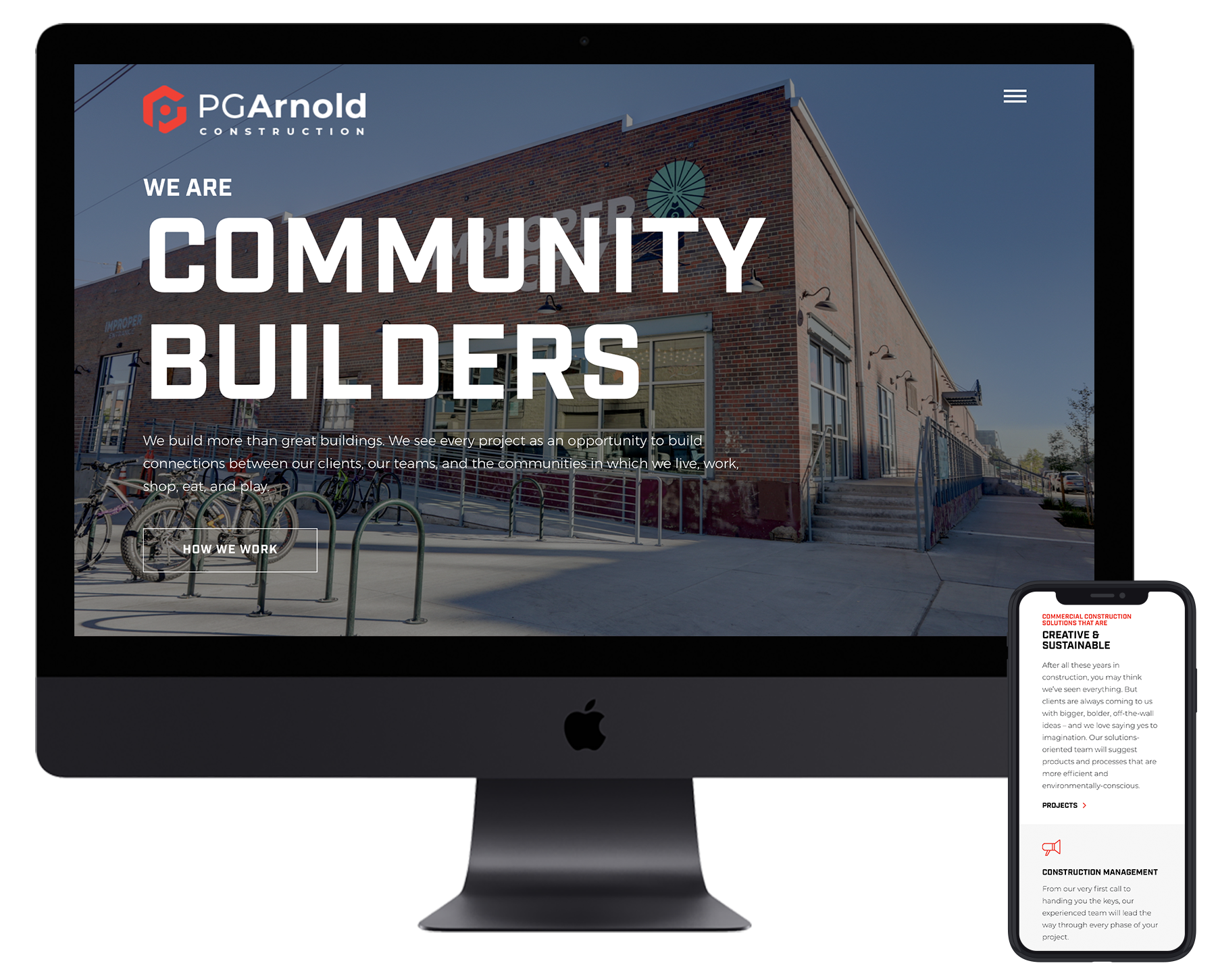
PG Arnold's shiny new online presence unites a blocky, industrial-looking font with immersive images and a bold brand color. Approachable, customer-friendly copy speaks to the brand story of "community builders" with an emphasis on craftsmanship. Images from past projects tell the rest of the story.
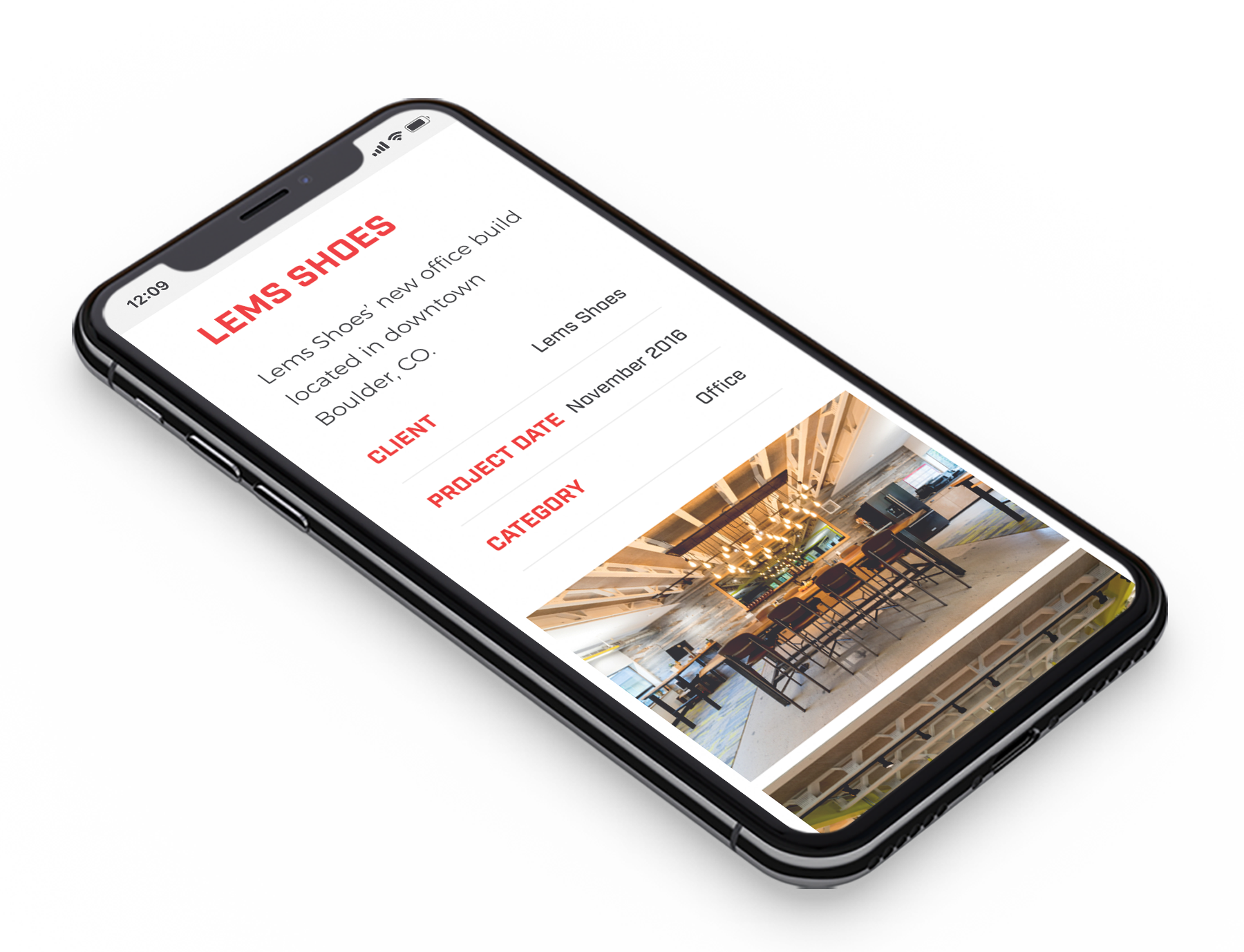
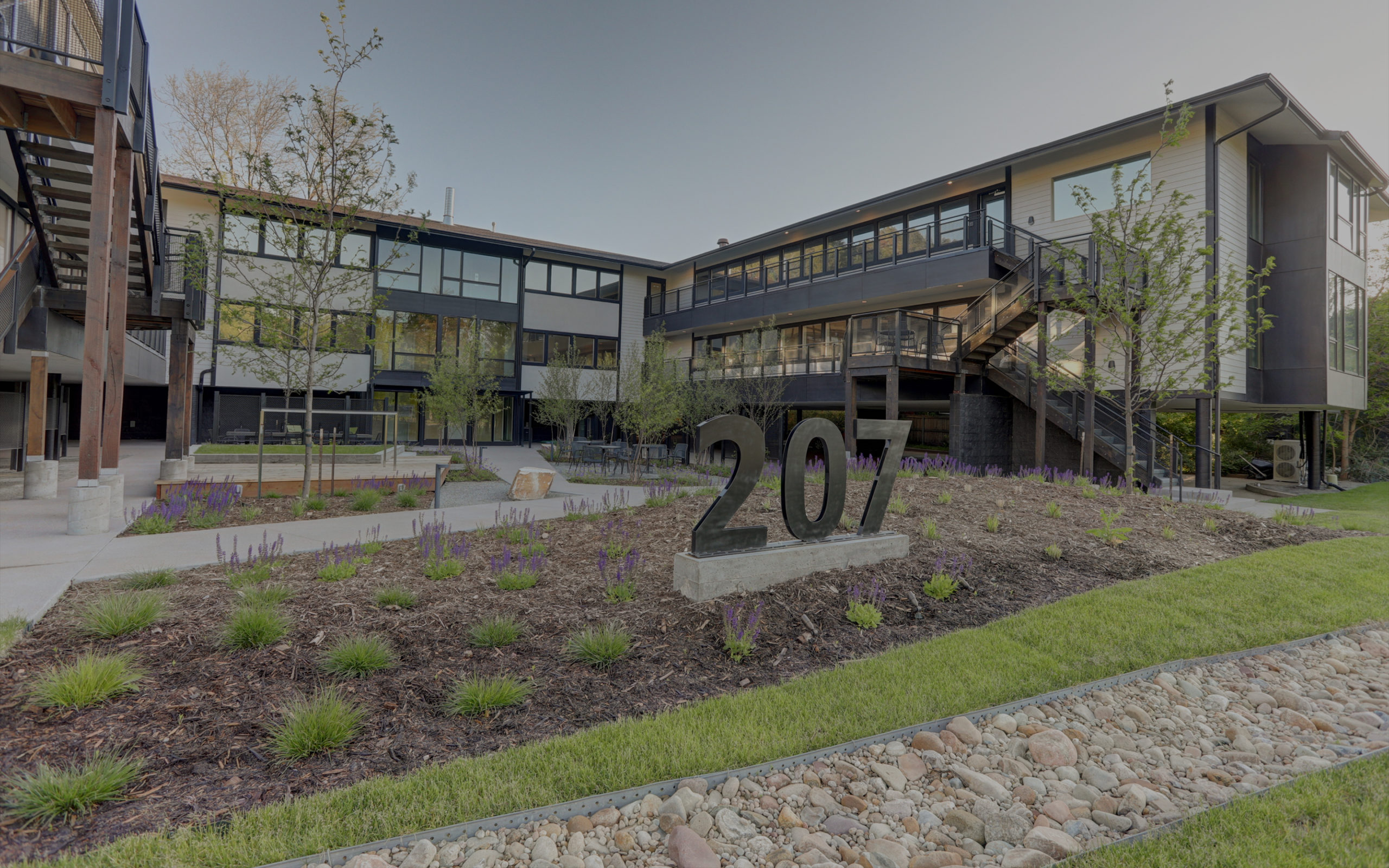
PG Arnold had amazing imagery for each of their finished projects, so we chose a portfolio page design that really helped their work speak for itself.