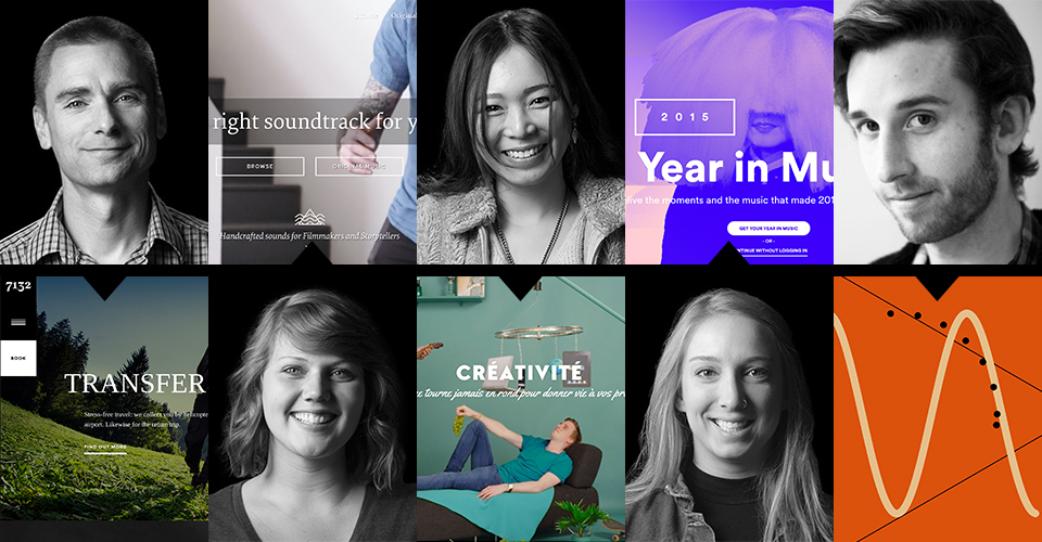
5 websites that get design right
Website design immerses visitors in an experience that’s easy to use, elegant, on brand and entertaining.
Our designers selected sites that captured their attention and explained what makes them fascinating. See how your website stacks up to these luscious examples in terms of functionality or just plain fun.
Scott Hooten: Creative Director. Runner. Car Aficionado.

7132 Hotel – Swiss hotel
This site for a high-end hotel in Switzerland does a great job of conveying luxury and attention to detail. Here’s what makes it stand out.
- The rooms in the hotel were designed by famous designers and the site experience is consistent with this brand feature.
- Navigation movement and flow is smooth and subtle in style.
- Adaptations for mobile work extremely well and allow for excellent exploration on phones.
- Typography is very clean and sophisticated throughout, feeling upscale and design focused.
Laurel Brunson: Graphic Designer. Cake Artist. Wannabe Mermaid.

Marmoset Music – Sound and music for filmmakers
I love the Marmoset Music website. I have gone there often for inspiration for UX design.
- From homepage to their content, they make everything easy and searchable.
- The homepage gives different ways of searching for music with each new slide. Once you get into the site, the filter options help you get exactly what you are looking for.
- Marmoset thought of everything! Their site and search features (the most important part) are easy to understand.
- Not only is their usability great, but their brand is solid and they speak well to their audience.
- This point doesn’t have to do with the site but their whole brand. They do a good job making you feel a part of them. They send things to clients to thank them for being a customer, give coupons and discounts for being loyal. They are just awesome.
Annie Seighman: Designer. Photoshop Trickster. Voltage DJ Extraordinaire.

Spotify Year in Music – Music Review
Okay. This website is cool. Here’s why:
The micro interactions, like loading animations, are unique.
- I like the overlapping and variation of size in the text and color blocks.
- It throws down a cool visual timeline approach to an auditory experience.
- The use of gradients, which are commonly considered to be outdated, seems refreshed in this use and ties all the different artists together with one type of image treatment.
- I think its interesting how they tied music to news stories. It really shows how all encompassing Spotify has become in the music world.
- You can also log into your own Spotify account and get a personalized look at YOUR year in music, which is then sharable and turns the whole experience into something better.
Jintanat Jintasawaeng: Graphic Designer. Fashionista. World Traveler.

Viens-la – French Digital Agency
This site is funny but cool at the same time.
- They have a lot of interesting and fun animation going on, but it’s not too busy. It’s just perfect.
- It’s never boring and you want to explore more because every page has it own interactive design.
- For example, most sites only show images of their work. On Veins-la you can hover and see unique animation of the project.
- The Team page is not just images and text descriptions but interactive. You can draw your mouse around and see their faces following your cursor. You can also change modes to see a normal image, a custom image or a funny one.
- They pay attention to the details. The Twitter icon makes the bird fly and a letter icon changes to a paper rocket when you hover.
- The site is designed beautifully with cool images and animation that communicate even if you didn’t read any copy.
- They use a lot of fun color in their site, but it doesn’t feel like too much because there’s a lot of white space to keep the look clean.
Patrick Meehan. UX Designer. Dog wrangler. Rock climber

Patatap – Just for fun…
If you like music and want to make some cool beats check out Patatap.com. It’s a great way to waste time or create a masterpiece depending on how you look at it.
- It works by turning your keyboard into a kind of synthesizer where each letter plays a different sound with a corresponding visual.
- The spacebar shuffles the sounds and colors.
- If you have kids let them try it. Though, you might want to put headphones on them because their musical brilliance may be better kept secret;-)
- Patatap reminds me that there is no limit to the things we can create with technology and design.


