

Developing Robust Content Slots on Salesforce Commerce Cloud Digital
Learn how to use Commerce Cloud Digital content slots to launch and maintain rich marketing content.
-

- Steven Cook May 16


…and how to design an inclusive eCommerce experience for all.
“Disability need not be an obstacle to success. I have had motor neurone disease for practically all my adult life. Yet it has not prevented me from having a prominent career in astrophysics and a happy family life.”
— Professor Stephen W Hawking
I found this quote in the foreword for the World Report on Disability, and it made me realize how much better the private sector – and a certain company who wants to be a Force For Good – can do when it comes to making the online world more accessible for everyone.
According to the World Health Organization, there are an estimated 253 million people who live with a vision impairment. Over a billion people – 15% of the world’s population – have some form of disability. That’s a lot of people accessing the web differently. If we’re not building websites that make their lives easier, we’re alienating a giant potential customer base.
For the impaired or differently abled, being online can be a sort of haven when the outside world is harder to navigate, especially in the fashion category. Having the ability to order more sizes online and bypassing physical barriers – navigating small aisles, reaching high clothing racks, trying clothing on – helps to allow for easier access and participation in the fashion industry. We need to keep pushing to make physical spaces more friendly to anyone with impairments, because if we’re only focusing on making online accessible, we are forcing a community to the back where they’re further unseen.
But, because we’re an eComm digital agency, let’s talk about what accessibility can – and should – look like online.
The A11y Project is an open-source site where you can access clear and concise information about, well, accessibility. Despite it being an incredibly complex topic, I think they do a great job making the information easy to consume. They start by slotting accessibility into four different categories, where each category represents a completely different user experience.
Associated conditions: Myopia, color blindness, glaucoma, albinism
Visual impairments can include non-sighted users, users with low-vision, users with obstructed vision, or even simply the aging generation.
Associated conditions: Presbycusis, acoustic trauma, auditory processing disorder, otosclerosis
At first glance, hearing impairments may not seem to have an impact on how we design for the web’s visual medium, but captions and fallbacks for sound-necessary media need to be considered for these users.
Associated conditions: RSI, cerebral palsy, Parkinson’s, muscular dystrophy
Motor impairments change how people navigate their computers and the Internet. People with motor impairments typically use a wide range of assistive technology, from specialized keyboards, to eye trackers, to using single buttons to navigate their computer.
Associated conditions: Down’s syndrome, autism, global developmental delays, dyslexia
We all process information a little differently, but some more than most. Cognitive impairments relate to the ease of processing information.
Temporary disabilities also come into play and need to be considered. We can all fall in and out of this sneaky category at any time – think about driving and using your phone hands-free, or watching a NSFW video at work and needing to leave the audio off.
Color blindness and low or total blindness can impact how someone receives your website. Understanding these impairments can give us more insight into how to design more inclusively.
Color blindness in particular affects the fashion industry, and online shopping in particular. Imagine wanting an orange couch, and being met with color swatches that weren’t labeled? You’d abandon your potential purchase in favor for a site that had taken the few minutes to label their colors!
There are three types of color blindness:
Deuteranopia / Dichromacy / Two-color vision
For people with dichromacy, what is intended to be a broad color palette might appear to be made up of different shades of the same hue. If your app uses colors to denote different labels or channels, the user won’t necessarily be able to benefit from that design feature.
Protanopia / Monochromacy / Total color blindness
While uncommon, people with this condition cannot see color at all. So, for example, bright or pastel interfaces with subtle gradients that rely on hues to differentiate features will be very difficult for the user to navigate. Action buttons might be hard to find.
Tritanopia / Anomalous trichromacy / Deficient color vision
With deficient color vision, one of the three cones in the eye malfunctions to varying degrees of severity. This ranges from near-normal color vision to two-color vision in severe cases. Users with anomalous trichromacy might find your logo or design to be less compelling if color is a major factor – especially problematic if the buttons and the text are rendered in indistinguishable colors.
This diagram shows the differences between some of the color blindnesses. Note that the circles and triangles show which colors are indistinguishable with Tritanopia color blindness.
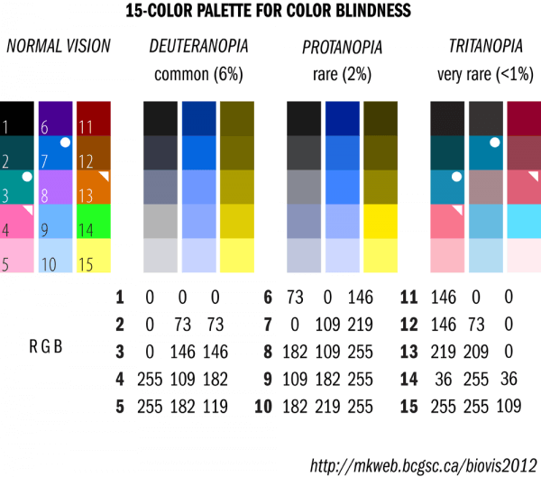
A diagram showing how different types of color blindness affect viewing color.
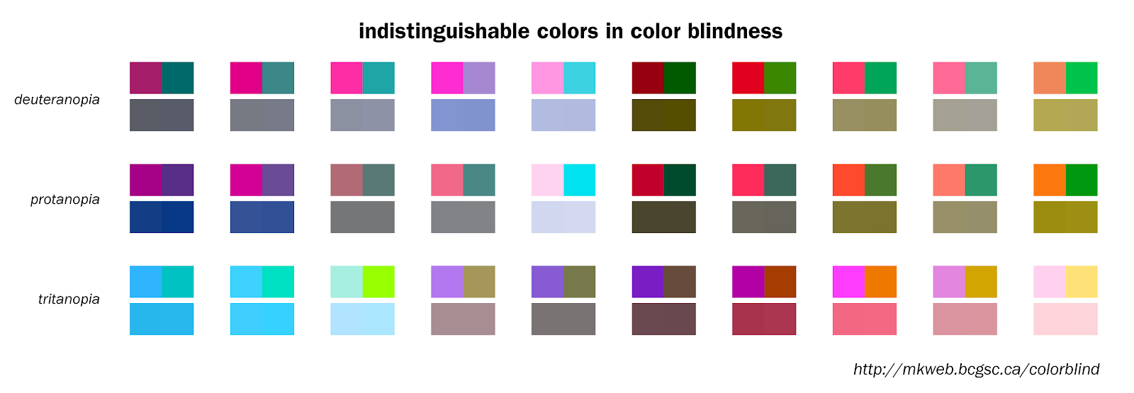
A diagram showing color pairs that are indistinguishable from each other with different types of color blindness.
1. Include names with color swatches. This will be super helpful to anyone who can’t see the color correctly. They want cool shoes. You want customers. Just help them out by making it easy to choose the color they want. Designers: If adding a name below a swatch is going to break the grid look, take a note from Amazon, where the name appears at the top, and on hover when color options are available.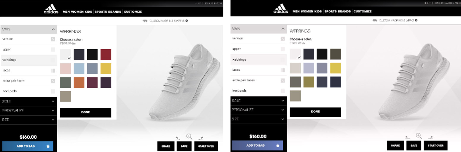
Comparison between two images showing differences in unlabelled color palette views. In the image on the right, color blindness makes it impossible to know which color you are really selecting.2. Use textures and patterns with colors to further emphasize differences in data or sections that are defined by colors, like in bar graphs where the color is next to each other.
3. Don’t define actions by colors. Make sure that any action, buttons, links, or CTAs are not defined by color alone or that they could be misleading to users who can’t see a difference in the color. You can utilize icons like checkmarks and Xs to help make decision-making easier.
Seeing an interface in black and white will allow you to see some of the flaws easier.
A UX example where red is used as a callout. Red is particularly tricky because it’s often used to signify an actionable item.
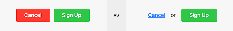
Buttons with red/green color combinations are notoriously difficult to see. Try to employ design variations that are a step towards not needing the color cues to make a decision.
4. Check your contrasts! Use a good contrast in colors so that the text is clear and easy to read. There are plenty of tools to check if yours works – my favorite is here.
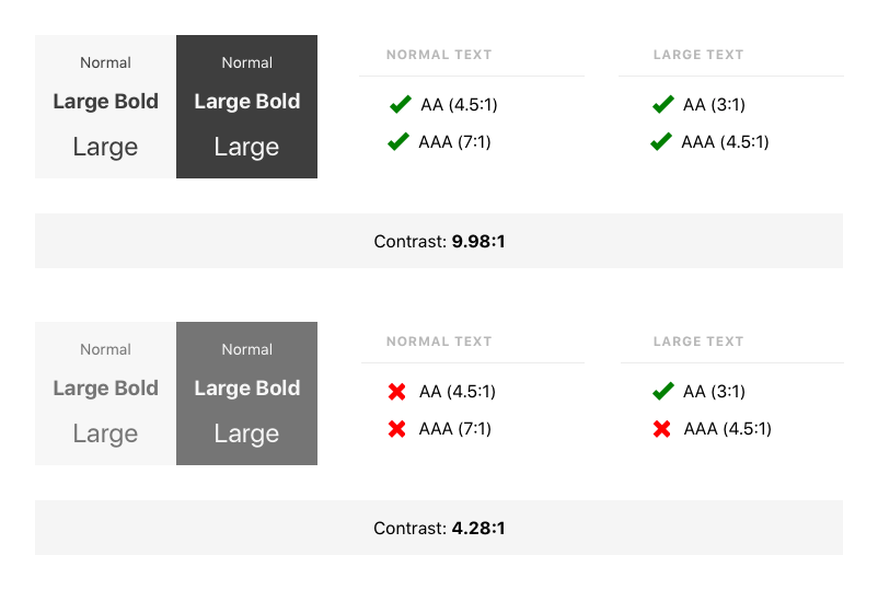
Use a generator to check your font contrasts to see if they meet common readability standards.
5. See if your color palette can be adjusted. A great tool checking your color palette is Color Safe. It will make your choices easier if you’re struggling. It will only give you colors that will work. If you’re coming up blank, this site generates random color palettes that look nice!
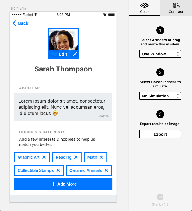
Want to see how your page looks through the eyes of someone who is colorblind? You can check your page here!
Navigating the web with little or no vision is surprisingly not that difficult when you have tools to help you. Still, we can work to make it so much easier with some simple changes. Low-vision or blind users typically rely on screen readers and refreshable Braille displays. For those with low but functionable vision, software that magnifies a page can help, too. Some people even use all these tools at the same time. Here’s how they work:
Screen readers are software tools that read aloud the text from a screen or braille display. The user can send commands by pressing keys (on the keyboard or braille display) to instruct the speech synthesizer to read or spell a word, read a line or full screen of text, find a string of text on the screen, announce the location of the computer’s cursor focused element, speak automatically when changes occur on the computer screen, and so on.
Refreshable Braille displays: These displays are pretty expensive, running anywhere from $3,500 to $15,000, but are incredibly useful to anyone who can read Braille. Pins electronically move to represent the copy on the screen. Some displays can connect wirelessly, others by USB. The biggest advantage of a display over a screen reader is that it provides direct access to information. Based on the model, Braille displays can show from 40-80 characters at a time.
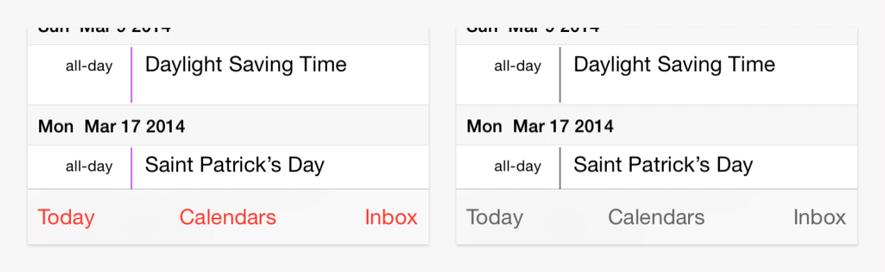
1. Use relative sizing for fonts. Avoid specified font sizes and work with relative font sizing like percentages and ems – these allow users to magnify the type on your page while allowing text to flow with your design better.
A wikipedia article displaying magnified font size.
2. Fill in your icons. Thin-lined icons look nice, but if you’re hoping someone with low vision is going to see them, they’re not as effective as an icon that’s filled in.
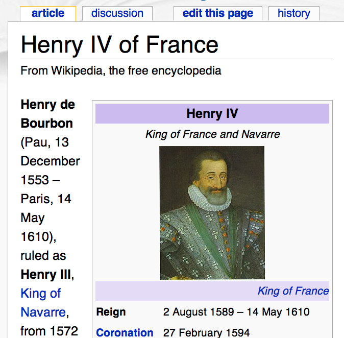
3. Check your contrasts. Use high-contrasting colors so that the text is clear and easy to read. There are plenty of places to check if it works – like here. You should also provide the functionality to reverse the page to increase contrast and reduce glare.
A reversed wikipedia page where the text is white, and the background is a dark grey. The links are now yellow to provide a greater contrast than if they stayed blue.
4. Use alt tags for images and videos. Include descriptive alt text for all images, as well as captions and labels that fill in missing context for screen readers. Describe the function of the graphics if there are any (like, “size chart” if it’s an image instead of selectable text). Here’s an example of successful alt text for an image:

A young man casually sits on a ledge with graffiti behind him. He is wearing a leather bomber jacket, white shirt, grey pants, and black oxford shoes.
5. Label forms. Keep labels on your form fields, and if you’re using placeholder text, make sure that the contrast passes the minimum required contrast level.

H&R Block’s form field displays acceptable contrast.
6. Use precise language, such as verbs on button tiles, to let the user know they can “continue,” rather than presenting them with a suite of “yes” and “no” options.
7. Keep a border on forms. Give forms a border to clue the user where to put their information.
8. Limit how much information is shown only on hover. When a user is navigating with voice-controlled software like Dragon, they’re limited to selecting actionable links – the software doesn’t recognize hover states.
9. Assign ARIA attributes (Accessible Rich Internet Applications). ARIA is an easy and powerful technical specification for ensuring your site structure is accessible. By assigning ARIA roles and landmarks to web elements, you enhance the ability of screen reader users to navigate and interact with your content.
10. Be considerate with your dynamic content. Screen readers might not catch things that update without a page refresh, like popups, overlays, and modals. Keyboard-only users may be trapped in these overlays, too (ARIA roles and alerts can help in these scenarios). Be sure your video player can be used with a keyboard. Closed Caption all your videos and include transcripts. For slideshows, include alt text and be sure your slides can be navigated via keyboard.
One of the biggest obstacles when navigating the web with an auditory disabilities is when there aren’t transcripts for videos or audio. Another is autoplay. Picture opening a page that blasts jarring music or video when you open a page – but you can’t hear it, and to your embarrassment, end up disrupting your surroundings.
1. Avoid non-consensual content. Don’t auto-play music or videos – wait for the user to interact with your content. If you must auto-play, you can add a visual clue that a sound or video is playing. This also applies to ad content. Don’t use modals, overlays, or pop-outs that force a user to look for where a sound is coming from – or overlays that make it harder for someone to turn sound off. (Those with standard hearing will thank you, too.)
2. Closed Caption and transcribe. Audio and video content should be transcribed. This isn’t just for those who are deaf or hard of hearing, but also for weirdos like me who prefer to just watch videos in peace and quiet. This also ensures more people will consume your content – especially on social media.
There are a ton of different tools for navigating online with a motor disability. Dragon, a voice-controlled software, reads pages similarly to a screen reader, making it essential to code with this in mind. Camera cursor control software like Cameramouse allows the user to control their cursor with just a webcam and the movement of their heads. Sip-and-Puff assistive technology offers control through the breath – the hardware can recognize sips and puffs and translate it into commands such as mouse clicks or keyboard characters. Eye tracking is also common, using a camera placed near the screen to track the movement of the eye to navigate the page.
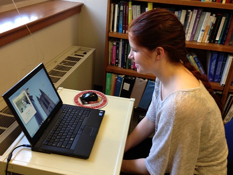
A woman uses CameraMouse eye tracking to navigate her computer.
1. Make clickable actions large. Concise, clear actions that can be easily recognized as actions are helpful to anyone.
2. Give form fields space. Give users with shaky or clumsy motor skills some margin for error with a good amount of padding between form fields, helping them to avoid selecting the wrong field.
3. Design for keyboard- or speech-only use. This covers low- to zero-vision users as well. Two-in-one, you can’t lose with this tip!
4. Design with mobile and touchscreen in mind. Most users with disabilities use touchscreens, but they need a little more padding between things to correctly select anything actionable. Keep in mind that overly complex layouts will hurt their ability to navigate easily, leading to unintentional frustrations.
5. Provide shortcuts. Chances are, when you’re looking at a website, you skim and skip around. Shortcuts can allow all users to skip to what they need to without having to read everything or miss something that they need.
Learning disabilities such as dyslexia, autism, and global developmental delays can make navigating online tricky, especially where certain design patterns are concerned. Dark patterns are tricky for anyone. With some small tweaks, you can gain some brand loyalty points from treating people right.
1. Use clear messaging. Keep it simple. Using punchy language might be fun for your brand, but when it comes to actionable items, it’s better just to make absolutely sure that the user can make out where it will lead.
Sorry InVision, your buttons definitely don’t earn you any acccessibility points.2. Use images and graphics to support complicated text. Seeing data and information presented visually in good, clear content will help anyone get the concept more easily.
3. Use multiple content formats. Everyone absorbs information in different ways. Visual content like images and videos can help reach different users – audio, too.
4. Keep content short. This article is a nightmare for this rule.
5. Be consistent with your layouts. Help users focus on content by keeping things left aligned and predictable, or add more visual clues.
Eventually, we all will be disabled – whether through age, temporary illnesses, or injury. By increasing our comfort level with accessibility standards, we solidify that the websites we build will be usable longer, by more people. If you’re going to spend the time and money to update or redo your site, I believe it would be a mistake to not keep some of these little changes in mind that could otherwise cause you to alienate an audience of customers who are ready to buy.
VOLTAGE is a creative agency specializing in giving your business a leg up in a performance driven world. Through brand design, creative strategy, and execution, we can drive results for your marketing.
Learn how to use Commerce Cloud Digital content slots to launch and maintain rich marketing content.

How VOLTAGE helped Chipotle increase revenue by addressing scalability, time to market and user experience.